Hello,
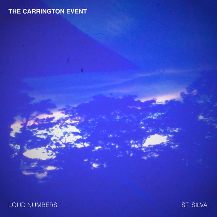
Last Friday, my friend and transatlantic collaborator Duncan Geere and I released “The Carrington Event”—a data sonification of the largest known solar storm in history from 1859. It was distributed digitally via the French net label Camembert Electrique.
You can read all about its creation in the first slot of this edition below. On a personal note, this nearly year-long project was a joy to work on. The idea was simple: what would it be like for two artists to take the same dataset and “perform” (ie sonify) it live?
The result was months of Zoom calls, swapping data notes, sharing tips on music gear, and giving feedback on sonification parameters. Each of us interpreted the data in our own musical fashion and performed the piece live. And finally, we decided to record each and release them as a split EP, which you can find below. I’ll likely to a longer reflection on this process at a later date, but for now I’m happy to have it out in the world. Thank you to Karen Aplin and Giles Harrison for giving us access to the storm data, and to Miriam Quick of Loud Numbers for production help.
In the rest of this Data Curious, I’m also thinking about in-situ maps and flexible clustering analysis tools. Enjoy.
Read
The Carrington Event
We did a full writeup on our process, so I won’t add more here. As a snippet, here’s the TLDR version taken from the Loud Numbers website:
In 1859, the Sun belched out a huge ball of plasma. This plasma hit Earth, causing the strongest solar storm in recorded history - known as the Carrington Event after one of the many astronomers that monitored its progress in magnetic observatories around the world. As auroras danced across the skies as far south as the Caribbean, these scientists dutifully logged its peaks onto graph paper.
In 2012, a Carrington-sized storm narrowly missed the Earth, and by this point scientists had learnt enough about solar storms that they were very, very, very glad it did. To try to learn more, physicist Karen Aplin and meteorologist Giles Harrison painstakingly digitised the yellowing records of the Carrington Event from Flagstaff Observatory in Melbourne and published their findings in 2014, offering the data up to anyone who wants it.
In 2024, musicians Duncan Geere and Ben Dexter Cooley decided they wanted to experiment with live performances that use a process called "sonification" to turn data into sound. Both had experimented with sonification in the past, but wanted to find new, more expressive ways of rendering data through music. They decided to team up, collaborating on the creation of a data-driven score from the data published by Aplin and Harrison, but then interpreting that score in their own musical styles.
Read the rest of the writeup here and listen to the piece on the Camembert Electrique label page.
Explore
New York Noise
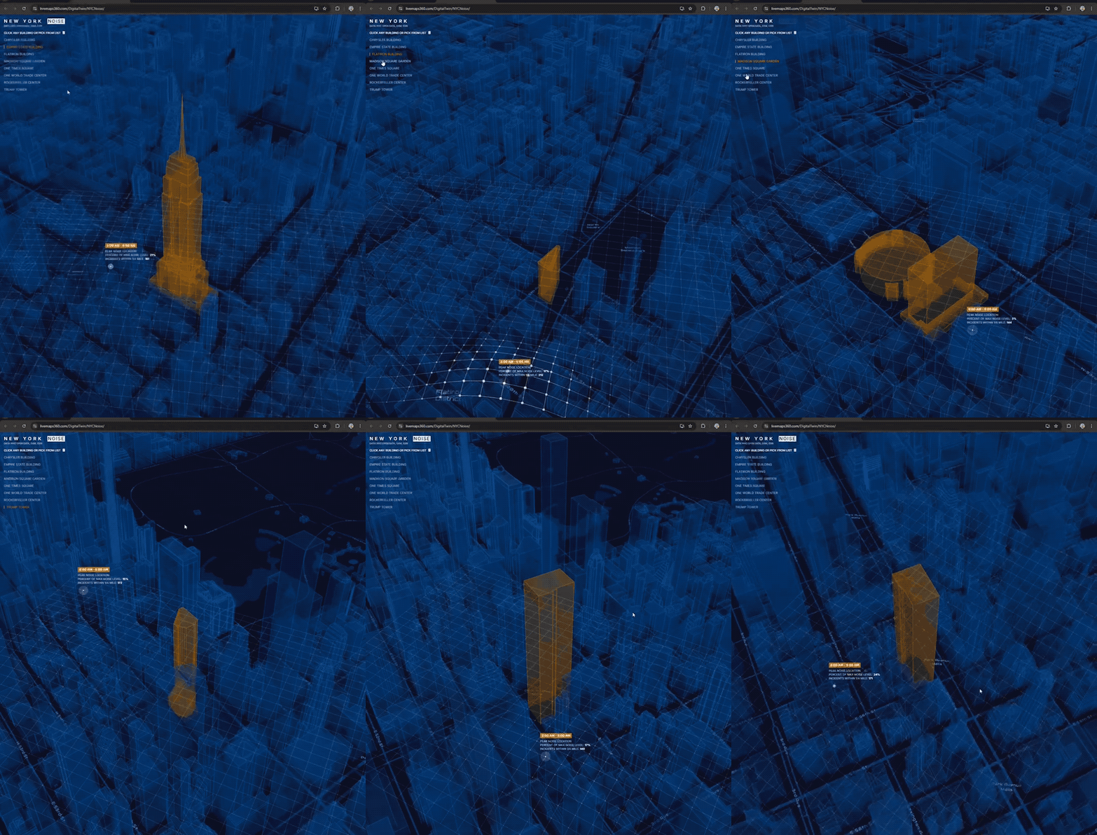
A curious bit of geospatial visualization, “New York Noise” shows, for every building, the surrounding noise complaints by time of day. The technical bits (data querying, kernel density algorithm, data meshes, spatial rendering) all seem very impressive. But when I went to the page, hosted by Live Maps 360, I couldn’t find any details other than what I saw on LinkedIn: it was built by Sajit Thomas who works at Esri.
Regardless, I like this map conceptually quite a bit: it uses open data from Open Data NYC, and also allows people to click on any building to see where the noise complaints arose in relation to this building. This places the user in control of grounding the map in their own lived experience, with recognizable names and places. A very modern interface.
Learn
Jupyter Scatter
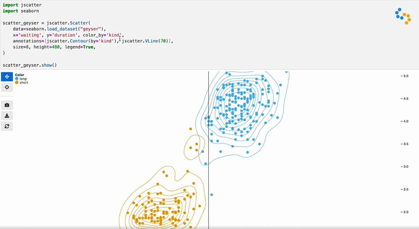
Visualization researcher Fritz Lekschas recently announced a new paper and software tool called Jupyter Scatter, “an interactive scatter plot widget for exploring large-scale datasets in Jupyter Notebook/Lab, VSCode, and Google Colab with ease.” The package has some nifty tools, like contour lines, user annotations, and search widgets. The performance also looks impressive, with the ability to explore millions of data points from within a Jupyter notebook.
Having worked with data scientists in the past, I’ve learned firsthand how important notebooks are to their workflow, so it’s interesting to see a custom visualization tool being developed as “Jupyter-first” so to speak, rather than trying to force other packages to work well in Jupyter after the fact.


