On teaching code for data visualization
End of term reflections, end of year lists, and NormConf
Hi,
It has been a non-trivial amount of time since last newsletter edition. But I wanted to get a final letter out before the end of the year—so hello again!
As we’re approaching “reflective season”, folks seem to be starting their end of year lists, New Year goals, etc. I am certainly not immune. In fact I love a seasonal (if somewhat arbitrary) tradition. So this edition will feature some of those roundup style lists.
As for next year, I plan to do some thinking about what Data Curious 2023 will look like. Long-term subscribers will know that the newsletter has taken various shapes and forms, evolving as my own interests and work have evolved. And I’m sure in many ways, next year will be no different. Still, I’m taking a the next few weeks off to do some regrouping, cataloging, archiving, and thinking about how to best continue this newsletter according to its original stated purpose: exploring new ways of seeing and experiencing the world around us through information and data.
Last thing to share: I’m feeling very excited about a new online community that has popped up recently. It’s called Decibels, and it’s a new group of folks interested in data sonification and multi-modal forms of communication. If you’re into that sort of thing, click the link above to join the Discord and come say hello! We will be kicking off some fun excercises and projects in early 2023.
Read
On teaching how to code data visualizations
Over the past year, I’ve taught two different classes as an adjunct at Northeastern University. Both focused on using programming tools to create visualizations. After this semester, I had some thoughts about what worked well and what did not. So I wanted to write up my findings. In the process, I also realized just how multi-disciplinary the skill of visualization truly is. Overall, it was a valuable experience and I hope for a similar opportunity in the future.
In the true spirit of the times, I am increasingly skeptical of any type of social platform (including the “blogging” ones) that is at the whim of tempermental tech billionaires. So this post is just a simple HTML page that I tacked on to my portfolio site. It’s very bare-bones at the minute, but hope to build out more of a blog-style page next year. For now, it’s purely functional.
Explore
End of year visualization lists
It feels a bit lazy as someone who often aggregates links for this newsletter, but both of these lists have so much thought and work put into them. Why add anything else?
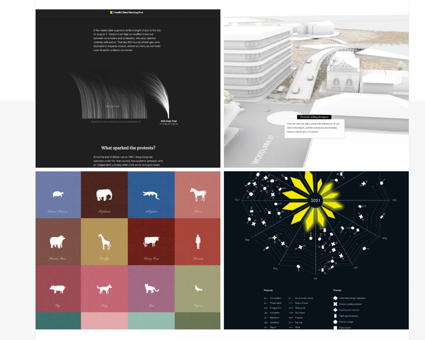
If you’re looking for some top-notch visual inspiration, data-driven stories, and interactive explainers, check out the recently announced Information is Beautiful Winners list along with the annual Pudding Cup. Nothing else to add, except that now I want to make bubble tea.
Learn
NormConf
Sadly, I was crammed with grading final assignments last week, so did not get a chance to watch this live. But thankfully all talks were recorded and shared! I love the principle of this conference: all the simple, but extremely useful, topics that are not typically covered at tech conferences since they are too “basic”.
This big-tech stance feels extremely exclusionary to newcomers (and experienced devs too, since the world of development is so big). So it’s refreshing to see a talk lineup that actually sounds useful to my work rather than elevated and obscure. Topics inlude “Group-by statements that save the day” and “Hack your way to a better API”. Will be making my way through the YouTube links over the next few weeks.


