Hello again,
It’s been that amount of time since I last wrote a newsletter. You know the amount of time—like when someone asks you “what have you been up to lately?” but far too much time has passed to actually describe it, so you just say “oh you know, just been busy”.
I’ve been busy. But with things that I am highly excited about! So I won’t give you a full rundown and will rather keep it to a bullet point list of links (as always, if you just want links to data-things, scroll to the “To read” section). In the past few months I:
moved to Burlington, Vermont!
inspired by my friend Duncan, created a new landing page that unites all the the things I do, work and “non-work” related. It’s a personal index of links.
attended a week long conference in Maine on visualization in science and education. Chatham House Rules, so can’t share much, but it was inspiring.
released an EP of songs, which you can find here.
performed a lot more music, especially under my electronic music alias St. Silva
Those are just a few highlights, all of which I include to say I have been taking some time away from data and visualization work to pursue my other interests. It has been rejuvenating. Now that I’m getting a bit more settled in my new city, I hope to continue some more newsletter writing.
For those of you who recently joined the newsletter, some housekeeping:
Hello! Thanks for subscribing.
This is an irregular newsletter that I write as a way to connect with others about shared interests. I don’t keep a strict schedule.
Someone brought to my attention a new O’Reilly book of the same name as this newsletter. I have no affiliation with Data Curious (the analytics book) and certainly won’t be writing about “applying agile analytics”. This is not a newsletter about making business decisions. But if that’s what you’re looking for, maybe check out the book :).
As a brief introduction, Data Curious (the newsletter) is about how humans interpret and interact with the world around us through data. I like to think of data as a lense through which we seek to understand things better. This lense can take many forms: visual graphics, audio sonifications, data sculptures. I enjoy thinking about these forms and discovering new forms that offer fresh perspectives.
So that’s what this is about, or at least tries to be. Here are some ideas of what I mean.
To Read

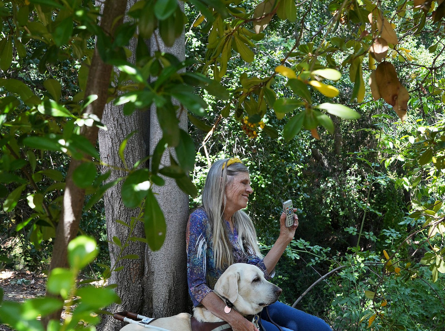
Birds are my eyesight
This article really gets at what I want this newsletter to be about: new ways of seeing, hearing, experiencing the world (side note: if you want a fantastic book on this subject, check out Ways of Being by James Bridle). Blind birders do this exceptionally well. They use a different kind of data (sounds vs light hitting photoreceptors). And in doing so, they create a rich map of the space around them, with nuances and features that sighted people rarely ever appreciate. As a birder myself, I envy this skill and hope to improve my birdsong recognition by ear. The piece includes some lovely interactive widgets that translate how bird calls are converted to speakable phrases.
To Explore
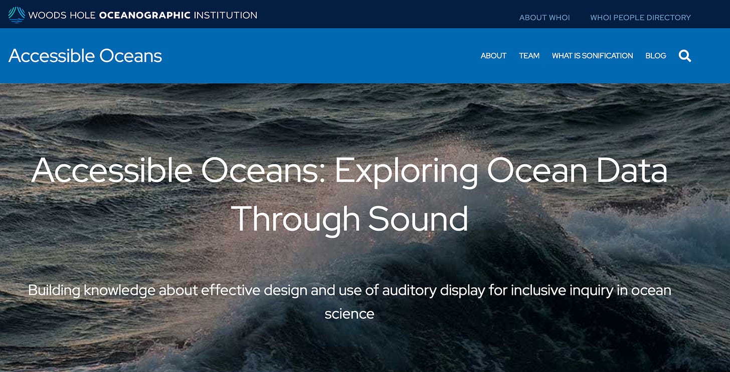
Accessible Oceans
One of the “public” projects that I can talk about from the GRC Viz conference is Accessible Oceans, a fascinating research from the Woods Hole Oceanographic Institute aiming to “build knowledge about effective design and use of auditory display for inclusive inquiry in ocean science”. Dr. Amy Bower and Dr. Leslie Smith presented at the conference and explained how they were co-designing their auditory displays with feedback from blind and visually-impaired students along with their teachers.
One of the most challenging aspects of sonification is honing on common auditory conventions—what naturally feels small vs large, for example? By incorporating feedback from visually impaired students, the team is iterating through new ways of sonifying ocean data. The blog posts and radio-style “data nuggets” are excellent, and I look forward to following where the project goes next.
To Learn
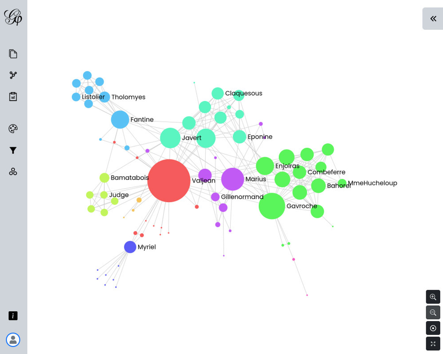
Gephi Lite
Gephi was the first network visualization software that I ever tried. The desktop app at the time was…rough (it was capable, but the UI was very bad). So I was excited to see the announcement blog for Gephi Lite, a simiplified web-based version of Gephi. I think this approach could open up network viz to a wider audience for students, citizen scientists, etc. No coding required.


