Digging through the Earth
Responsive vs redesign, a tunnel to the other side, and mapping a million nodes
I don’t have much to say in the preamble to this edition except for this:
There is nothing more badass than a woman protesting in Iran right now.

Last night, thousands of protesters in Iran gathered to remember Nika Shakarami, a 16 year old girl who was killed by the morality police at a street protest last month. Two days ago, they gathered for Mahsa Amini, another young woman killed by the Iranian authoritarian regime. Both times, they were met with violence. More protesters were killed.
At a loss for what to do, the thing I am hearing again and again from Iranian-Americans is to not be quiet. To share their stories. As the Iranian government tries to block the internet, make sure the world is watching.
So in addition to the usual, on-theme type links you can expect from this newsletter, I’m including a few pieces that I have helped me to understand the long and complicated history that led to this moment in Iran.
Listen to Throughline’s “The Woman Question” podcast episode
Read this piece on why young Iranian women “have nothing to lose”
Watch/read this story on the significance of hair-cutting in Persian culture
And now to the regular content.
Read
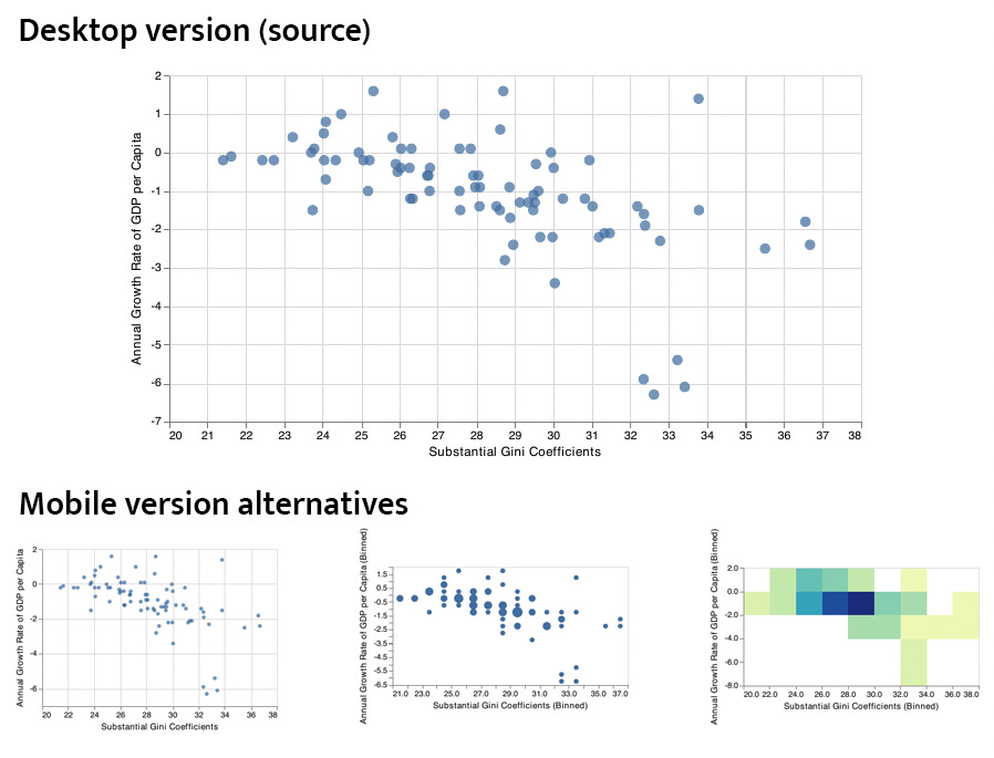
How can we tell if a mobile visualization retains the message of the desktop?
This one’s a bit wonky (as most academic pre-print blog posts are) but worth a read. Creating visualizations for mobile is often tricky, but I like how this paper re-orients the problem around “re-designing” rather than “responding”. So often in my work, I find that a completely different chart works better on mobile rather than a “smaller version of the same chart”. The researchers summarize their findings by looking at how to design the best responsive solutions for visualizations given a “viewer’s ability to identify data points, compare pairs of data points, and recognize implied trends in a visualization.”
Explore
The SuperTunnel Simulator
When you were a kid, did you ever plan to dig to the other side of the world? Vinicius Sueiro, information designer and developer, asked this same question and, incredibly, has provided you with the details on how to do it (details on direction, that is). Enter your location and move the direction compass to see where you would end up in the world. My favorite part of this project is a video of Vinicius demoing the tool with a real shovel connected to a smartphone. Such a fun combination of digital and physical.
Learn

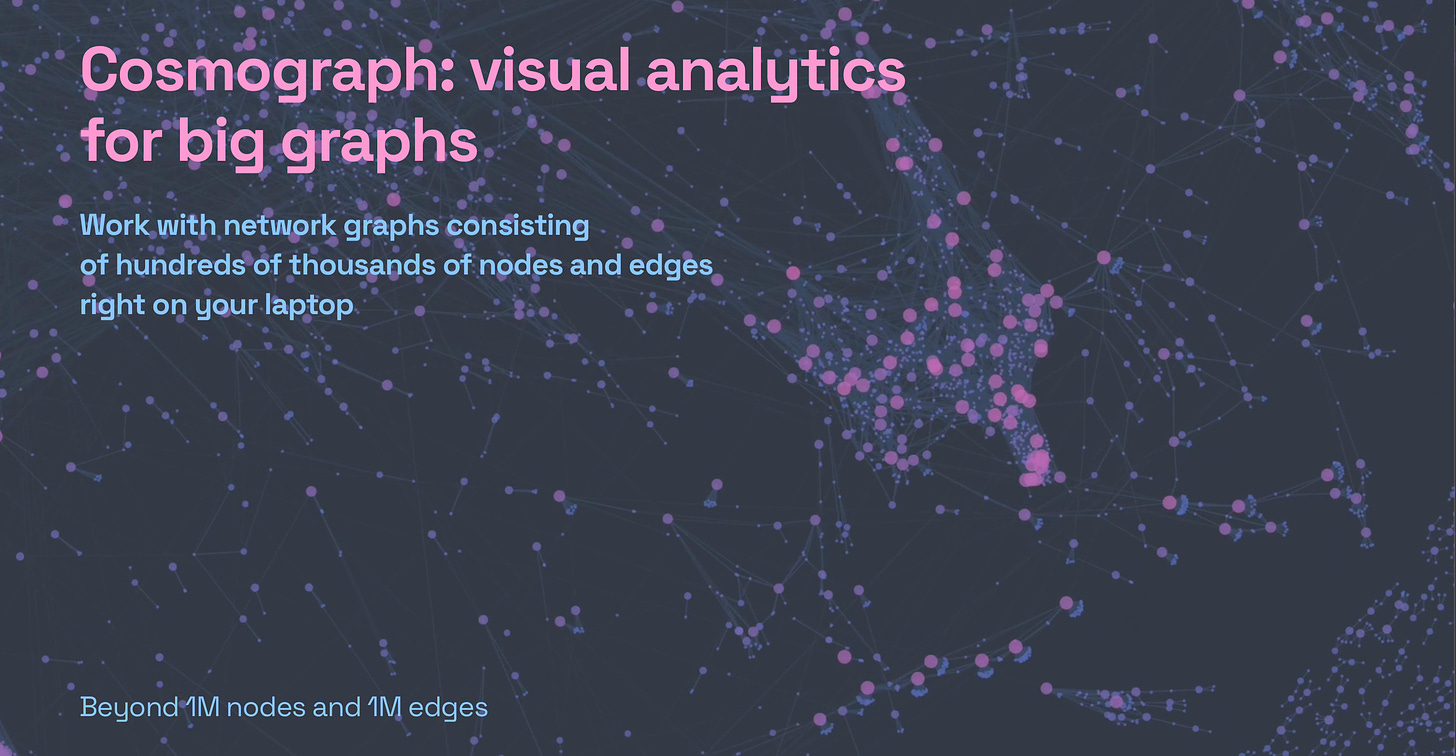
Visualize a million network nodes with Cosmograph
Cosmograph is a new browser app that allows you to load a csv file and visualize connected relationships for big datasets. The interface seems fairly intuitive and the performance is impressive: over a million different nodes, and no noticeable lag time. The power of WegGL at work!


