Hello,
Time is short and projects are many. Trying to stay consistent with this newsletter amidst it all.
A few notable updates:
my first published work with the Center for Community News is live—a map and story (written by students) of mail-in ballots received and tallied by the Secretary of State in Vermont (where I live). In 2021, Vermont passed legislation to make universal mail-in ballots a permanent part of general elections, a real no-brainer for democracy. We plan to measure, twice a week, how many people are taking advantage of this option in a post-Covid-lockdown-era world.
my friend Nate created a music visualizer video for my recent data sonification release “The Carrington Event”. It is spectacular and you can watch it here.
i have been inspired by brutalist web design lately and so re-vamped one of my websites: bdextercooley.com used to be a single landing page with a list of links to my other sites and profiles. Now it is still a landing page, but also has a lightweight blog/public notepad feature. I spend so much time wrestling with code in my day job that, for my personal sites, I really love when things just work and are dead simple (I’m using Eleventy, for the technically curious)
It’s peak foliage season here in Vermont, so I’m going to stop writing now and go for a walk. Here are some interesting things I found in the past two weeks.
Read
Weekly Chart—Decision Fatigue
I'm generally a fan of most things published by the DataWrapper team, but this Weekly Chart stood out. I like that the author, Erle, shows critical thinking about the data gathered from Reddit in order to do the analysis. Erle starts with a basic chart, and then revisits certain assumptions about the data inherent to his starting point.
This is a great example of using visualization not as the end goal, but as an additional step in verification: gather data, visualize, check assumptions made about initial data, and then re-gather and re-visualize.
You can sign up for Datawrapper’s “Weekly Chart” newsletter here.
Explore
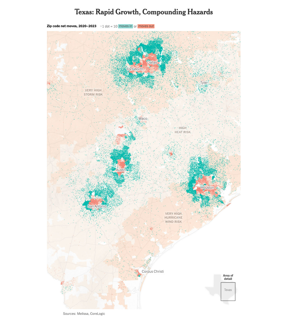
Where Americans Have Been Moving Into Disaster-Prone Areas
Another fantastic scrolly map piece from NYTimes (gift link to get around paywall here). This topic, where Americans are moving, will continue to be important as we see climate change making disaster-prone areas even more dangerous. In addition to the analysis provided here, I would have liked to see some visualizations on the reasons why people are moving from certain areas into other areas.
Learn
How to make an Upset Plot
I was unfamiliar with UpSet plots before, but they have an interesting use case as an alternative to Venn diagrams. Nils Gehlenborg shows how they can be used in this gif. Learn more about their benefits from his announcement post, from the Wikipedia page or read the full paper here. There also appears to be an R package to make Upset plots quickly.


