Hello,
This summer has brought a lot of change for me, but perhaps most relevant for the topics covered in this newsletter is a new job. As of Monday, I started a new position at UVM’s Complex Systems Center. I’ll be creating data visualizations to explore complex systems emerging from research at the university. I will also be supporting the new Center for Community News initiative—very exciting for me, as it’s a return to my early roots in data journalism. That’s about all I know three-days into the gig.
I’ve worked in academia adjacent fields for a while now, but this is my first position fully embedded. So if you’re in that world, and interested in data visualization and complex systems, say hi on LinkedIn (and include a note so I know its not spam). I haven’t been very active but with a new position starting I’m re-evaluating it’s usefulness in a positive way. Maybe we will cross paths someday!
In other news:
my first foray into sound installation concluded last month. This project was a sort of data sonification, but using colors from a camera instead of a CSV of data. I am still working on a full write-up of the event, which I’ll share when it’s ready, but for now you can see some clips on Instagram
I have a new data sonification piece coming out soon (release date TBD) with Duncan Geere & Miriam Quick (aka Loud Numbers)
I am currently at the Association for Education in Journalism and Mass Communication (AEJMC) with the Center for Community News. My brain is too fried to synthesize it yet, but I’ll probably have a lot of data journalism thoughts in the coming week.s
I have been slowly building a small modular synth and taught myself to solder. It is very scary but also very fun.
I’m (re)-learning to skateboard
I try to keep this newsletter mainly focused on ideas around data and visualization and creative coding, but I also like reminding people I’m a human with widespread interests and they don’t all need to connect :). As we all are!
Ok, enough rambling. If you’re interested in anything that I write about, data-related or otherwise, you know how to reach me: reply to this email or send a message on LinkedIn. Not on any other channges at the moment.
Read

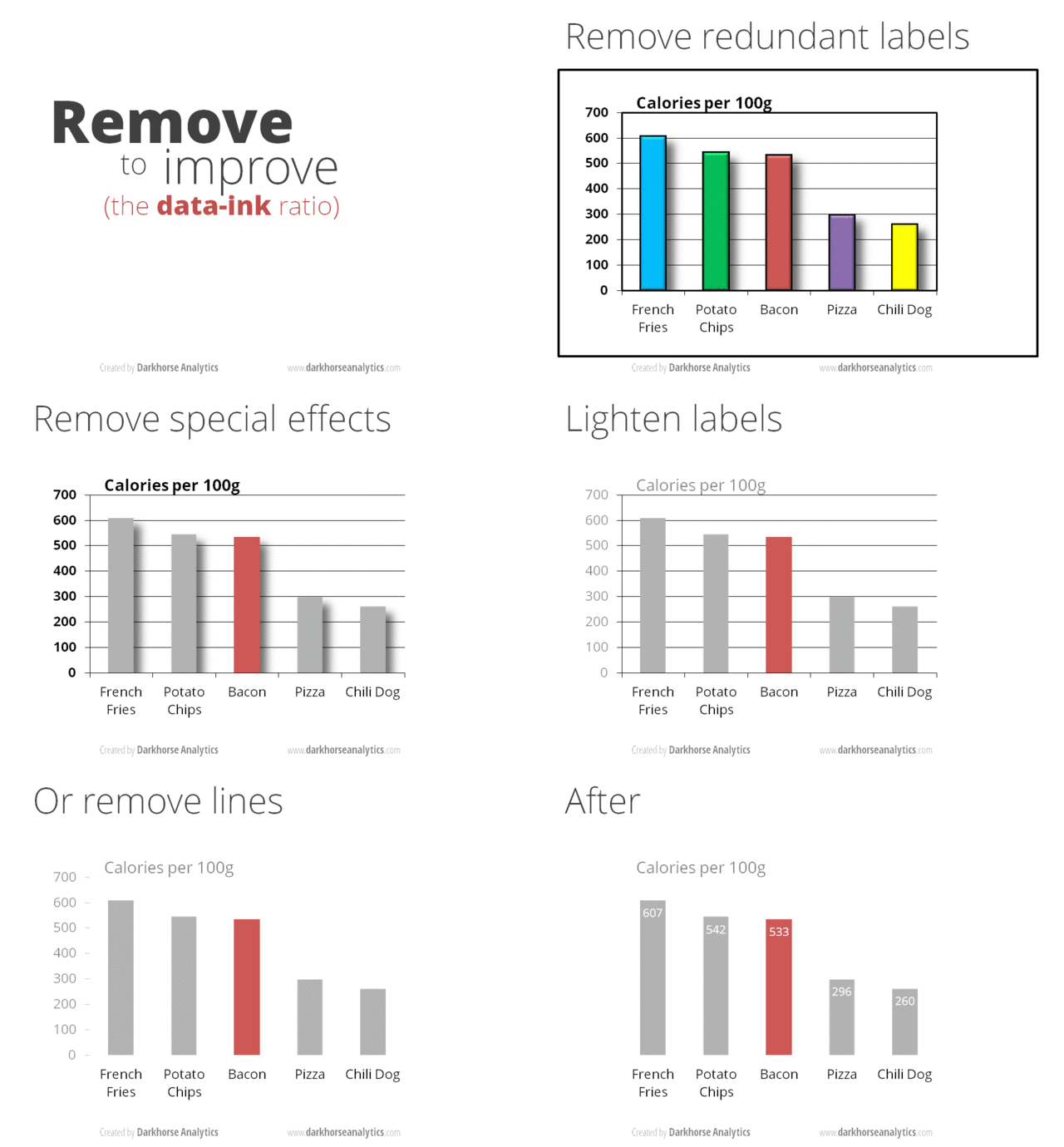
How Data-Ink Ratio Imposed Minimalism on Data Visualization
Ah yes, the tyranny of minimalism. I was reminded of the perennial "data-ink ratio" debate last week when I gave a guest lecture on data viz fundamentals to some graduate students. It's an intimidating task—how do you cram in the basics on creating a good visualization in one hour? Oh and also, the field is constantly questioning and re-evaluating what "good" even means.
Inevitably, I used some Tufte examples in my slides—not because I agree with him, but because (regardless of your opinions on Tufte the man) he has been a formidable influence in the field of information visualization for decades, for better or worse. This article is a good entry point into why we should critically examine some of the assumptions that Tufte bases his claims on. There’s a lot more research I could link to (email me if you’re interested) but I’ll save that for another post.
Explore
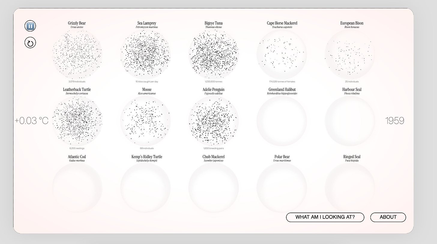
Macro-Microscope
I discovered this work a while back on the Decibels Discord (if you’re interested in data sonifiation, you should join us there).
“Visualizing the Unimaginable: hyperobjects and data visualization on the Anthropocene”, is the dissertation project of Rodolfo Almeida. It was conducted at the LabVis laboratory, for the Post-Graduation Program in Design (PPGD) of the School of Fine Arts (EBA) of the Federal University of Rio de Janeiro (UFRJ).
The site displays how different species have been affected by rising temperatures over time. The work, which Rodolfo describes as an art installation, is a brilliant example of data visualization reaching beyond the realm of statistical charts and graphs, delving into the conceptual and emotional challenge of resonance—how to make people feel the data. not just see it. It is also a great example of multi-modal visualization, as the sonification layer evolves at the same time as the dancing dots swarm. The sound design is beautiful, and I think fits the theme very well.
Last thing I’ll include is the intro to the “what am I looking at” button, because I found it so striking, and so relevant to the types of questions I have been wrestling with in visualization for some time now—issues like climate change play out on an entirely different scale than humans are used to. We need new visual language to math this scale. Explore the full site here.
In the face of climate change and the dawn of the Anthropocene, we as humans are constantly challenged to reflect on our impact over our planet and to perceive the interconnections among the many forms of life that inhabit it. Recently, ideas such as the concept of hyperobject, defined by philosopher Timothy Morton as an entity that is challenging to visualize due to its scale (whether too large or too small, or both) have shed light on the need to transcend the narrow human scale to counteract the climate crisis.
Learn
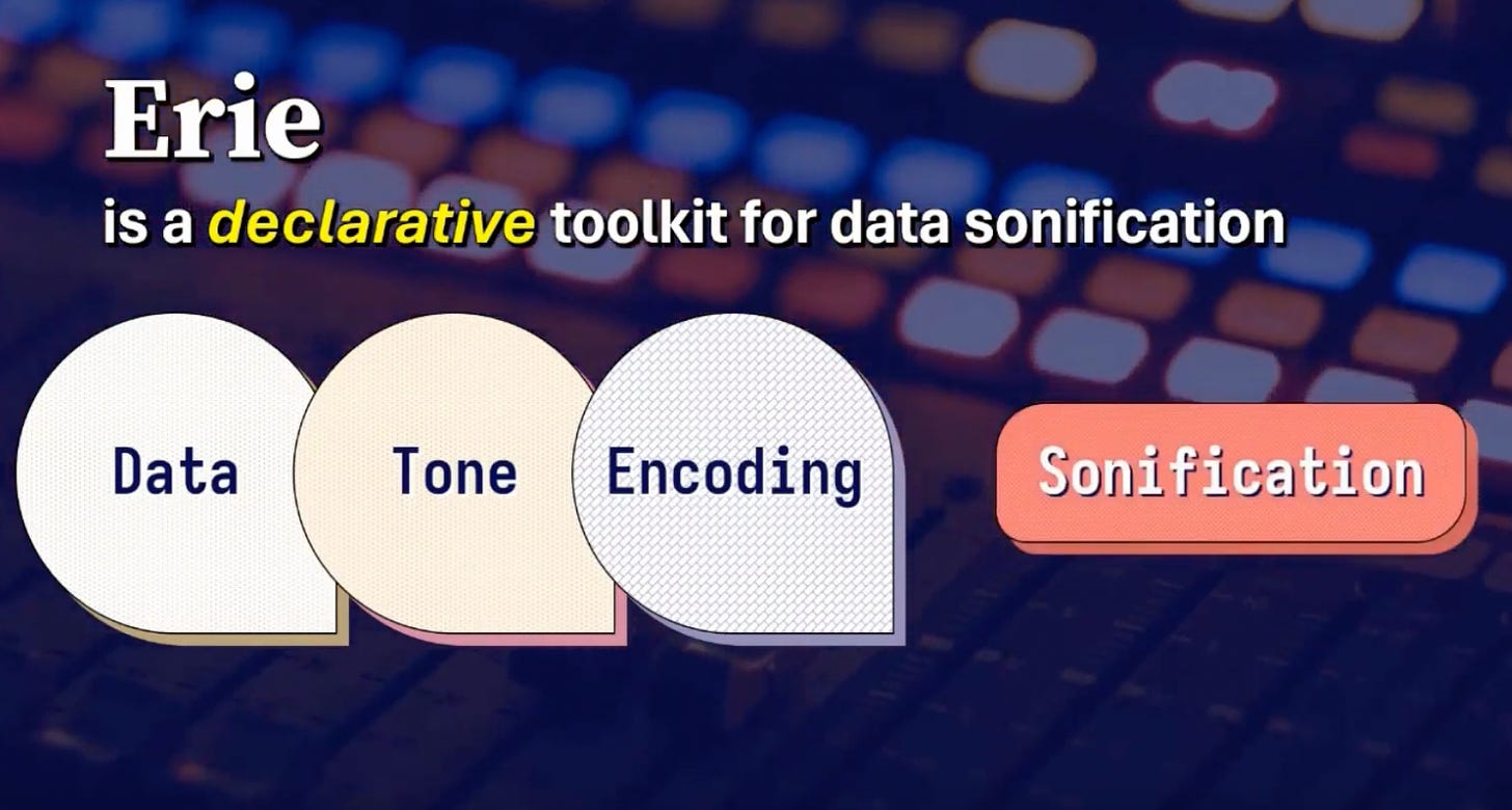
Erie: A declarative grammar for sonification
If, like me, you missed Outlier conference this year, you’re in luck—they just posted many of the full talks as a playlist on Youtube. I’m slowly making my way through them. This talk on Erie.js, a declaritive grammar for data sonification. If you’ve ever used Vega/Vega-lite, the conifuration will look very familiar. I have yet to try it out, but seeing as Vega-lite is so well supported, it seems promising.
That’s all for this issue. Hope to be back with more of these editions over the next few weeks!


