If you’re new here, hello. This is a newsletter about how we use data to understand the world—visually, sonically, philosophically. You won’t find much in the way of “here’s how to make a better chart” material, although sometimes that does make an appearance. Instead, I hope you find something that inspires you in the fields of data visualization, data sonification, new media, creative coding, visual art, etc. If that’s not your thing, you can unsubscribe at any time. Thanks for being here!
It's been some time since my last post. Since moving to Vermont in 2023, my appreciation for the seasons has deepened. Winters are long and dark here. Most things in life start to slow.
As folks tend to do, I'm taking stock of last year and thinking about the year ahead. I don't have any grand resolutions or changes for this newsletter. Only to keep sharing the things that fascinate me, that keep me curious.
Last year I was fortunate enough to expand my work into new creative territory. In addition to some exciting data visualization projects, I launched a some new media projects and dove deeper into data sonification.
For a long time it has felt like two of my worlds were separate: in one, the world of data visualization, technology, design, programming. In another world, music, songwriting, art, composition. The worlds seldom touched, and historically I think that was intentional—I didn't want my "work" life to bleed into my "creative/art" life.
2024 was different. I started and finished multiple projects that blurred the lines between my professional experience and my creative explorations. So much so, that i am beginning to feel that the worlds aren't so different after all. The end result and utility may differ. But fundamentally, i feel my work transforming into a practice of translation or re-contextualization. Creating new ways of seeing, ways of listening, ways of being.
Data becomes visual. Patterns become sounds. Movement becomes music.
Here are a few highlights:
debuted my first sound installation, Paralleling an interactive system that converted colors into sound at the Phoenix Gallery in Waterbury, VT
performed an interactive, audiovisual sound installation Dancer in the Loop as part of Burlington's Highlight NYE celebration
started a new job with UVM's Complex Systems Institute
released a collaborative data sonification EP of the greatest solar storm in recorded history, The Carrington Event, out on digital label Cambebert Electrique
released a collaborative album of ambient piano music Loading Screen Music with Coppermind (moniker of Ian Steinberg)
released Formations 1, a sort of sound journal collection
in partnership with Cornell's Lab of Ornithology, launched Map for Grasslands, a data visualization website and map that supports the passing of the National Grasslands Act
And now, on to some things that fascinated me recently.
Read

Data by proxy—material traces as autographic visualizations
A few weeks back, I started reading Autographic Design by Dietmar Offenhuber. I'm still making my way through the book, but find the practice fascinating:
"Autographic visualization is a set of design operations that focus on revealing physical traces to make the process of data collection more legible and accountable."
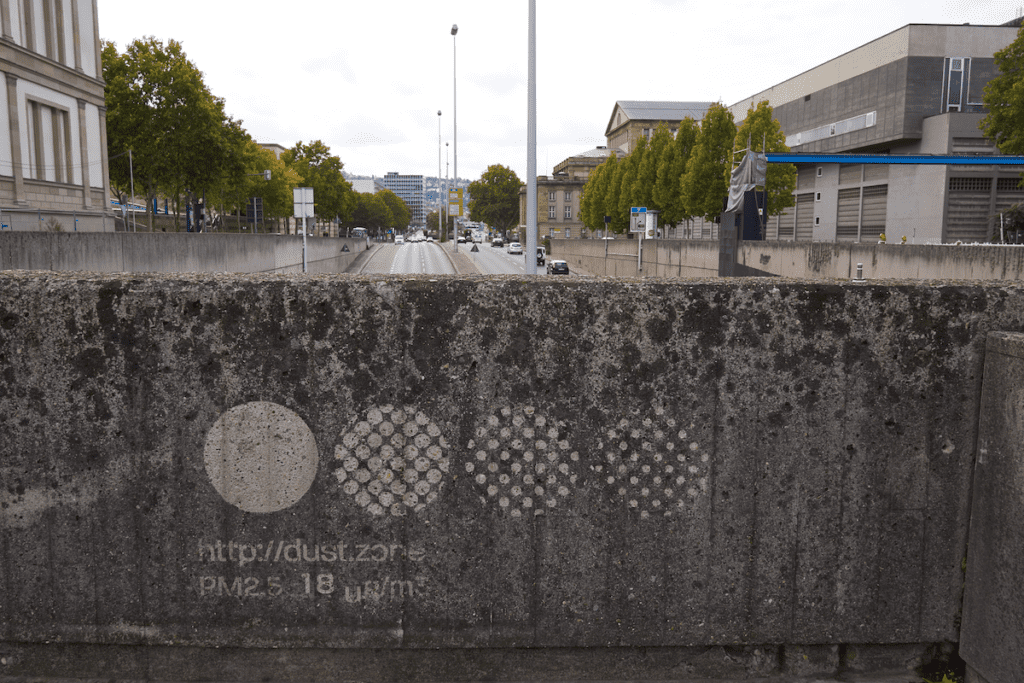
This article is a sort of summary of the key ideas in the book, and contain some examples of autographic design work. My favorite so far has been "Dustmarks", a method that revealed air pollution across the city of Stuttgart:
"The project visualizes air pollution by calling attention to the patina on the city’s surfaces. The dustmarks are executed as reverse graffitis, making the accumulated pollution visible by partially removing it. By calling attention to dust as a material rather than an abstract value, the project contextualizes the sensor measurements with their physical basis."
Explore
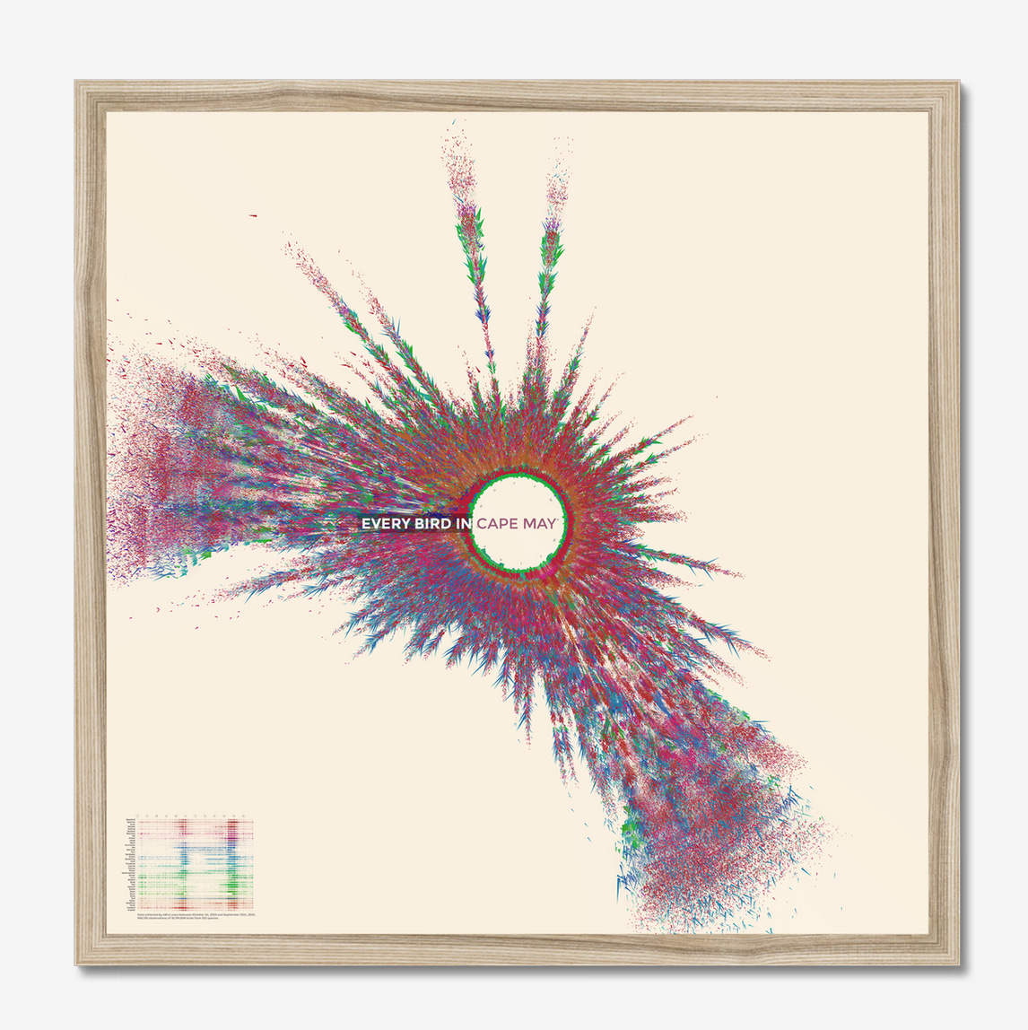
Every Bird.
The Every Bird project by Jer Thorp visualizes an entire year's worth of bird sightings (collected from eBird) for locations around the world. I love the design of these posters. Specifically, I love that they are not aggregated: each triangle is a bird. So much of data visualization reduces and aggregates. It's a refreshing approach to throw it all on the page—even if you lose some fidelity, the patterns are still there. And beautiful.
Learn
Top 5 Geospatial Data APIs for Advanced Analysis
A very useful list of (mostly) free APIs for geospatial analysis and mapping. Find things like an areas walkability, points of interest, and distance to the nearest supermarket, all with concise code snippets to get you started.
Unfortunately it is paywalled on Medium, so I’ll pull out the APIs here if you want to explore them directly:
Overpass - “the Overpass API allows access to the information available on the OpenStreetMap website”
Distancematrix.ai - “distancematix.ai API primarily offers two services: (1) calculations of the distance and travel time between points on a map, and (2) geocoding services”
Geoapify - “Geoapify is a platform that offers a set of APIs for a wide range of geospatial services.”
Amadeus - data on tourism sector such as hotels and points of interest for travel
Mapillary - “The Mapillary API allows to access all images available on the Mapillary platform. This platform is an open database of street images provided by volunteers across the globe.”


