I’m back with another edition of Data Curious. I’ve had some new folks signup recently, so here’s a very short re-cap:
Data Curious is a newsletter about how we see, hear, and experience data in the world. Each edition will include something interesting to read, explore, and learn from. I also will share a bit about my work and what I’ve been thinking about.
My main area of focus is data visualization, so if you’re into that you’ll likely find something of interest here. But increasingly I have also been exploring data sonification, new media, creative coding, and other mediums. So there’s some of that too.
To that end, I’m excited to finally share the full write-up for a project over the summer—an interactive sound installation at an art gallery near where I live in Vermont.

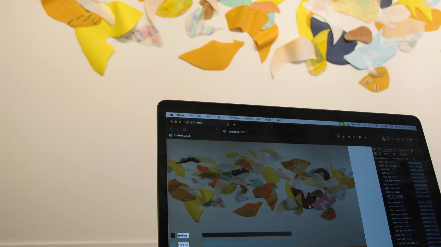
For a few years now I’ve put out electronic music under the moniker St. Silva. This was my first sound installation, and also the first time I’ve experimented with real-time data sonification. In collaboration with artist Linden Eller, I created some software that:
used a webcam to detect colors on the wall
quantified the colors and identify which pixels were a close enough match
converted this data into musical parameters and sent them to physical, hardware synthesizers
You can find more longform details about the installation in this blog post. The installation played out over the course of 2 days, so the soundscape is quite long: but I managed to take some audio recordings during that time, and later I created a short “audio collage” which combines the various sounds from the exhibit. You can listen that on Bandcamp.
It was a fascinating experience to hear how the soundscape changed as the mural was created, and I hope to do more of this type of sonification in the future. Ok, on to some links that I found interesting.
Read
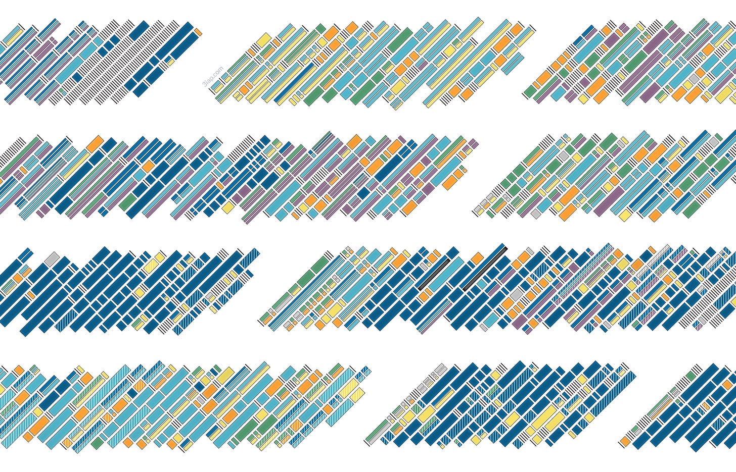
How long does data viz take?
As someone who gets asked this question all the time, I found this self-analysis piece to be really helpful. To be honest, most times I tell people “it depends” but that feels unsatisfying. 3 is a pattern does an amazing job in this piece breaking down different types of viz projects by their various tasks. Unsurprisingly, many times the “viz” part is not the part that takes the longest. Will definitely be sharing and revisiting this piece in the future. Visually, I also really liked the diagonal stacked bar charts, hadn't seen that orientation used before.
Explore
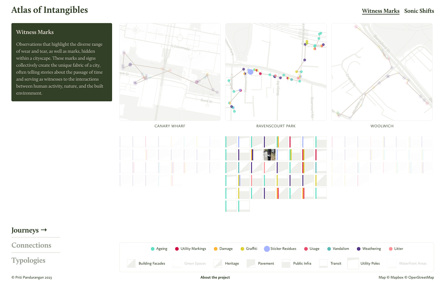
Atlas of Intangibles
Somehow I missed this piece last year in the data viz world. But wow do I love the Atlas of Intangibles by Priti Pandurangan. The design, interaction, use of small multiples, and map wayfinding is really lovely. More than all of that though, I find the concept brilliant: “a data experience designed to highlight the rich, interconnected web of sensory information that lies beneath our everyday encounters.”
As someone who thinks about sound a lot, I especially enjoyed the “Sonic Shifts” page of the tool, which includes audio recordings of spots along each map route.
Learn
Essentia - audio and music analysis
Haven’t used it yet, but definitely on my radar, Essentia.js is a Javascript library for music/audio signal analysis, based on the Essentia library written in C++. There is also a Python wrapper for the algorithms. After turning colors/shapes into sound, my mind is already drifting to the opposite: turning sound into colors and shapes. Essentia provides algorithms for spectral analysis, beat detection, mood detection, similarity, and much more.


