In defence of complexity
Data
Curious
2020.12.16
Hey,
It's been a minute. I'm back with a new edition of Data Curious. At my current rate, this will likely be the last edition of 2020. New plans for 2021 are in the works.
Approaching the end of the year, I find I have many things to say but not yet the words to say them. So let's just stick with the links for now.
Stay safe,
- Ben
////////////////////////////////
Read

In defence of data-dense visualizations
Visualization designer and researcher Richard Brath explains why we should not always shy away from complexity in visualizations. If you've ever read any of Edward Tufte's books, this will not sound unfamiliar. But I found this blog a good reminder of a principle I often forget as a visualization designer: simpler is not always better.
Explore

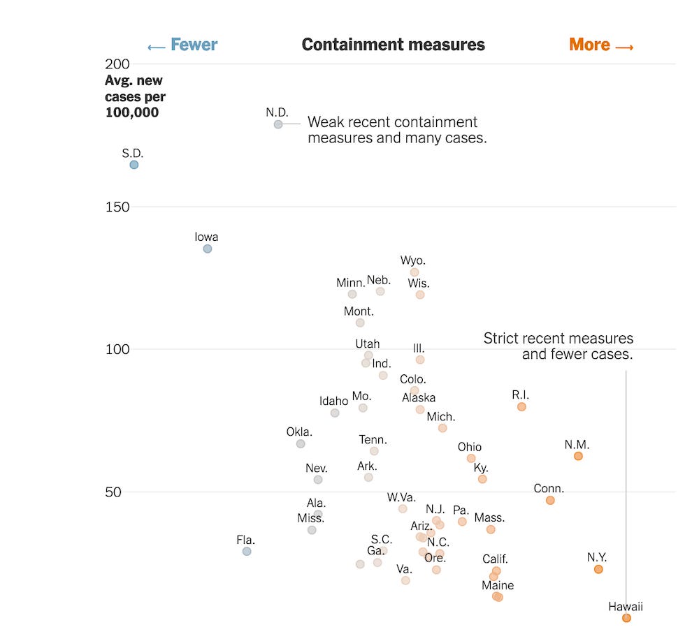
States that imposed few restrictions now have the worst outbreaks
There is a calculation playing out across every state in America: introduce mask mandates, restricting social gatherings, and closing high-risk venues like bars, and you will see fewer cases and hospitalizations. "The worst outbreaks in the country now are in places where policymakers did the least to prevent transmission..."
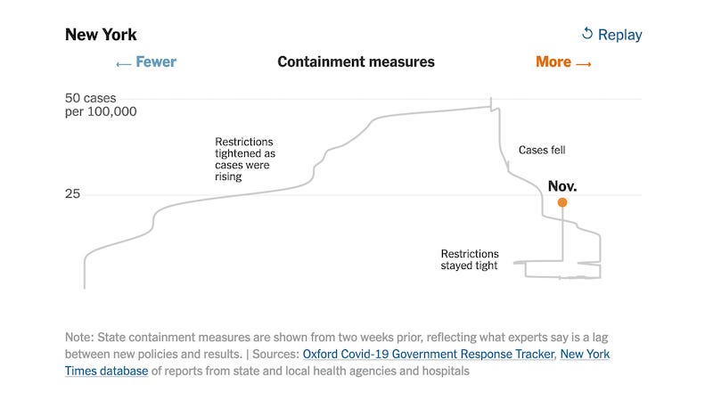
I found this animated chart particularly impactful in telling the story of how each state chose to act (or not act) to prevent coronavirus spread.

Learn
Why use a radial visualization?
An Observable tutorial with lots of code snippets.
How to use D3 force
An interactive introduction to force concepts.
Smoothly animate thousands of points with HTML5 and Canvas
I've started looking into Canvas for some recent projects with huge datasets, and this tutorial was a great introduction.
Spread the love.
Share this edition of Data Curious.
Have a suggestion? Want to get in touch?
Fill out this quick form and I'll get back to you soon.
If you're not a subscriber yet to this newsletter, you can sign up .


