Interactive Data Stories on Climate Change
Data
Curious
2020.10.21
Hey,
I've been heads down the past few weeks finishing up a recent project, so the newsletter has taken a backseat. But as of yesterday, I'm stoked to announce that my contribution to the latest issue of Parametric Press is live!
Parametric Press is an interactive digital magazine that unpacks complex topics using data stories. I've spent the last few months researching, writing, designing, and coding an interactive article for their latest issue on climate change. The process was collaborative, exhausting, and also lots of fun.
You can find my story highlighted later in the newsletter—it's about trees, and algae, and bioreactors, and all the science that tells us why we need all of these solutions combined to have a hope at preventing catastrophic climate change.
I have more thoughts to share about the process of publishing a digitally native, interactive article but I think I'll save it for a longer post in the future. Now for some recovery time...
- Ben
////////////////////////////////
Read

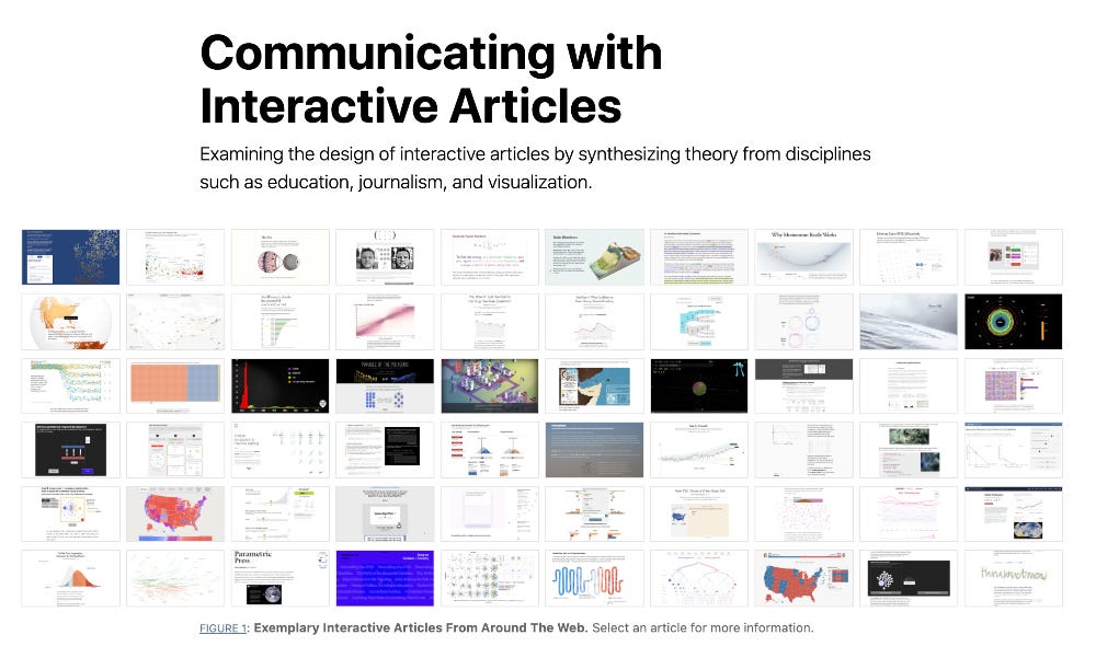
Communicating with interactive articles (or, a how-to on digital-first interactive publishing)
By chance, two of the editors at Parametric Press published an amazing bit of research a few weeks before the Climate Change issue went live that felt too perfect to pass up. Matthew Conlen and Fred Hohman collaborated to create this interactive synthesis of how to communicate on the web with interactive articles. It's a masterpiece of drawing from different disciplines and topics to showcase the best new methods of storytelling, from journalism to education to science. Well worth your time for a full read.
Explore

Tiny Algae and the Political Theater of Planting One Trillion Trees
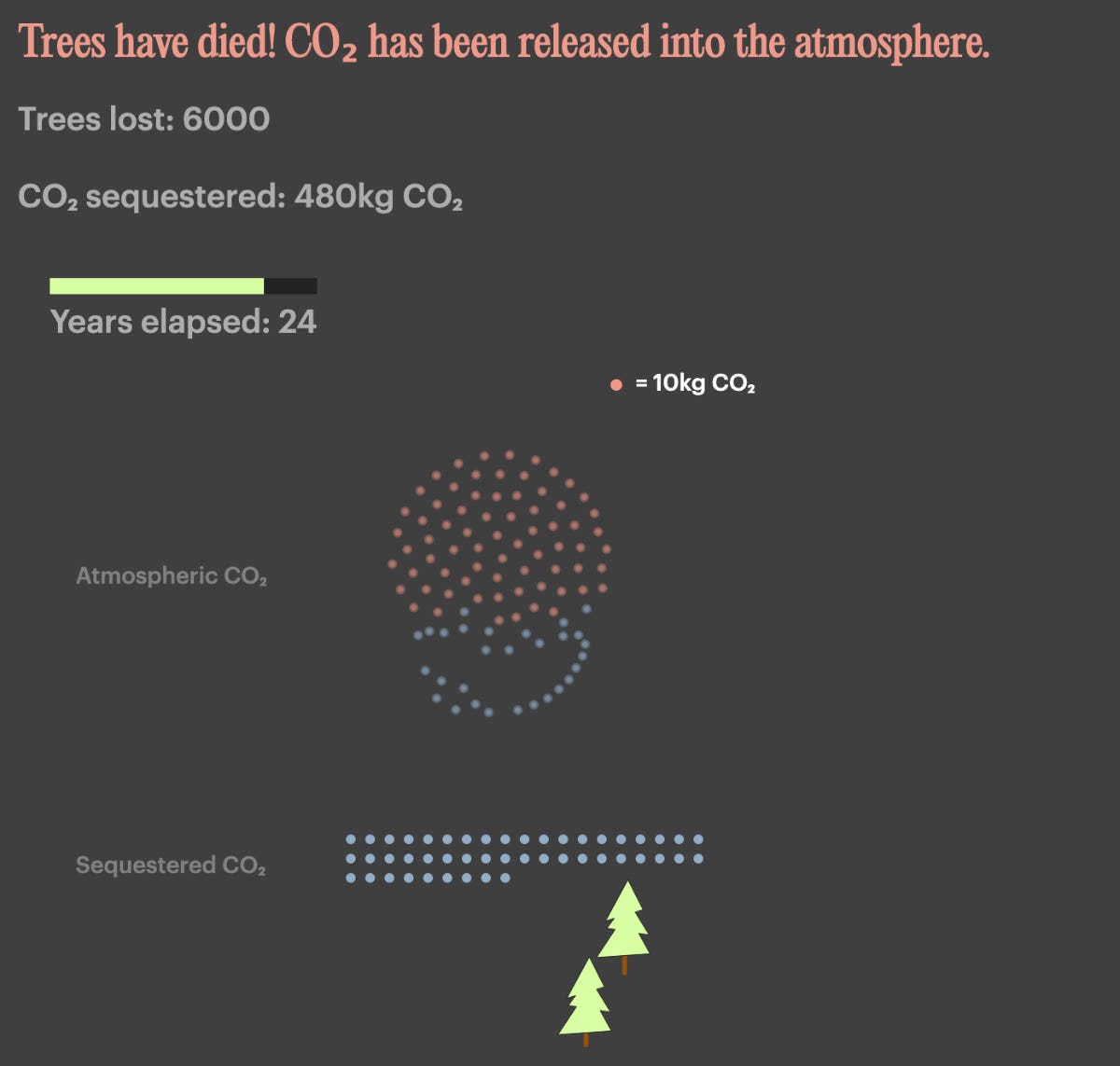
This is my piece for Parametric. I started out wanting to write about the carbon removal potential of algae; but the deeper I got into the science, I realized that to make a convincing argument I also needed to address other, better-known methods of natural carbon removal (like trees).
What started as a niche idea on algae carbon sequestration turned into a giant piece of reporting on the state of our climate pathway, the limitations of trees, the promise of algae, and the reality that there's no perfect solution. Along the way I had to figure out how to explain some of these concepts; thankfully, the Parametric team were more than happy to accommodate my weirdo ideas for simulations and charts to help tell the story better. Though I'm sure the explanations aren't perfect in some places, I'm really happy with how it turned out.
After checking out the algaue situation, you should really explore all of the articles in the issue: there is some amazing development work in each piece, and every author brought something different to the issue.
Learn
Creating data stories with ScrollyTeller
A new JavaScript library designed to make scrollytelling easier. Under the hood, it's built on the popular Scrollama library, but may be useful if you want something higher-level than that (more like a template to use with lots of stories).
How To Build And Deploy Your Dashboard With Python, Google Sheets, and Vue.js
Seems like a nice tutorial if you don't want to mess about with databases and servers: simply use Google Sheets and a lightweight Python script, with Vue.js as a frontend.
Animated, Responsive, and Reactive Data Visualization with Svelte
I've included a few Svelte resources before, but this one has the most interesting code snippets imo.
Spread the love.
Share this edition of Data Curious.
Have a suggestion? Want to get in touch?
Fill out this quick form and I'll get back to you soon.
If you're not a subscriber yet to this newsletter, you can sign up .


