Visualizing personal context
Data
Curious
2020.09.21
Hello,
Data visualization carries a certain weight of responsibility. If you create data graphics, you know how multi-faceted a task it can be: show the data, make it look nice, don't exaggerate findings, communicate the statistical significance. Through all of this, there is a commitment to the facts: no matter how controversial or disheartening, you don't ignore the numbers.
Our President ignores the facts at a meteoric scale. For this reason (and many others), a historic endorsement has taken place.
In 175 years, Scientific American has never once endorsed a Presidential candidate. Until now. Endorsing Biden so publicly is a true show of force from the scientific community that we need a leader who respects, not manipulates, the facts.
Stay safe,
- Ben
////////////////////////////////
Read

When Data Visualization and Art Collide in an Org Chart
Data artists Kirell Benzi outlines his process for taking a "data art" approach to visualizing complex organizations. Unlike data visualization, data art typically focuses more on the expression of an idea or structure rather than the graphical encoding of numeric values. His process is refreshing and beautiful to see unfold.
Explore

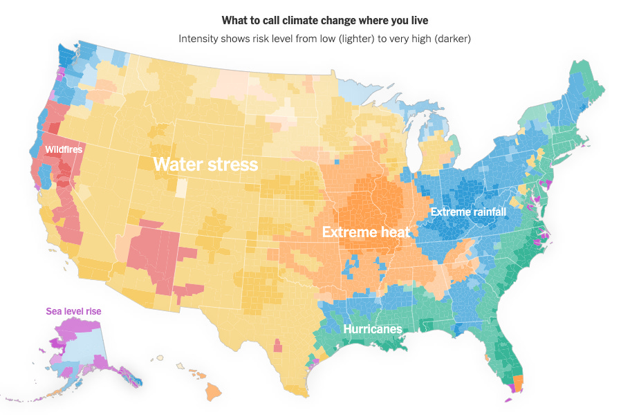
Every place has it's own climate risks: what is it where you live?
The NYT graphics team provides a perspective often missing from climate journalism: context and personalization. If you live in the west, the recent climate wildfires have brought the impacts of climate change to your doorstep. These increasingly dangerous natural disasters are occurring everywhere, but they have different names: hurricanes, drought, extreme rain, extreme heat. The map makes it even more personal by allowing the user to search for a zip code to see what is the highest risk for their community.
Learn
Visualize data structures from inside VSCode
VSCode has become my go-to IDE for development. Last week I stumbled upon this article and tutorial on how to use a package that visualizes data structures, objects, arrays, and more from within your dev environment. Seems super useful to get a quick sense of data structures. You can even make quick plot types like histograms and line charts.
Spread the love.
Share this edition of Data Curious.
Have a suggestion? Want to get in touch?
Fill out this quick form and I'll get back to you soon.
If you're not a subscriber yet to this newsletter, you can sign up .


