The Pulsar Plot
Data
Curious
2020.09.14
Hello,
Before I get to the links for the week, a brief personal note: today I'm starting a new position with Pattern, a team of visualization designers and developers at the Broad Institute. I'm so excited to shift my focus into the research community to build visualizations that push forward science in medicine, biology, and human health.
If you work in academia and/or this kind of space, please reach out and say hello! As someone who has worked in small startups my entire career, this will be very new territory for me and I have a lot to learn. But I'm excited to build data visualizations in this environment and can't wait to share new projects when they are ready.
Lots to do this week, so only a few links for your perusal. Enjoy!
Stay safe,
- Ben
////////////////////////////////
Read

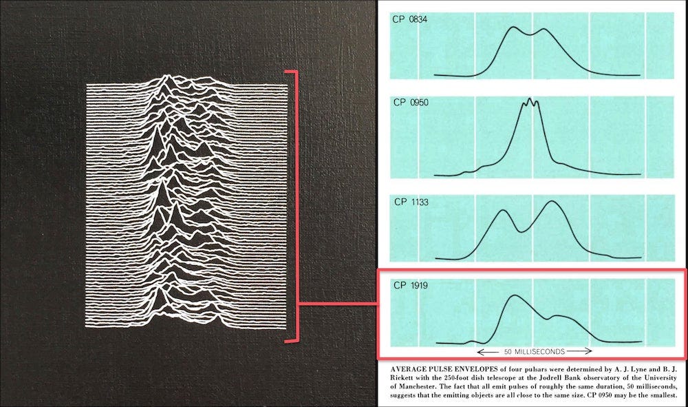
The Science Behind Joy Division's Unknown Pleasures Album Cover
Perhaps one of data visualizations most iconic pop art moments: the album cover of Unkown Pleasures by Joy Division. The pulsar graphic has become so well known that some people even call this type of chart a "joyplot" (others call it a ridgeline). The plot is supposed to show the radio frequencies of one of the first discovered pulsars. But what is a pulsar? How do you actually read the "joyplot"? Where did the data come from? If you've asked these questions, Scientific American graphics editor Jen Christiansen has answers for you.
Explore

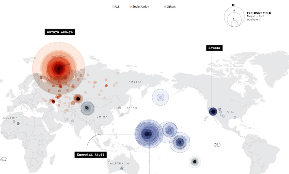
In a flash, a changed world
Some really amazing design work in this Reuters article commemorating the 75th anniversary of the nuclear attack on Hiroshima. Annotated maps, scientific illustrations, dot plots, and more convey the massive impact left by the world's first atomic weapon drop.
Elsewhere
Paul Murray debuted a new creature to the viz world...a swipey table! Genius way to show lots of related charts on mobile devices. View one at a time and swipe left/right to see other related metrics.
You must see this generative data portrait of endangered animals. Each dot represents one animal in the species. And it's built using p5.js, which is really cool!
Learn
Text Data Analysis and Visualization of Reuters Articles
Learn how to use Python to scrape, analyze, and visualize text data from the Reuters news site with this tutorial.
6 Ways to Speed Up Your Vue.js Application
I've been using Vue a lot over the past year so obviously, this list seemed useful to save.
Spread the love.
Share this edition of Data Curious.
Have a suggestion? Want to get in touch?
Fill out this quick form and I'll get back to you soon.
If you're not a subscriber yet to this newsletter, you can sign up .


