A Worker's Memorial Wall
Data
Curious
2020.09.07
Hey,
It's a holiday weekend in the US, so I hope that if you have the privilege of having the day off, you are taking it. I sure will be.
Yesterday I heard about a sobering tribute to some of the people who do not have this luxury: in Pandemic times, we call them "essential workers". Unlike wars and physically-based tragedies, there is no memorial wall or tribute to the doctors, nurses, clerks, and more who have died from COVID-19 while keeping our society afloat.
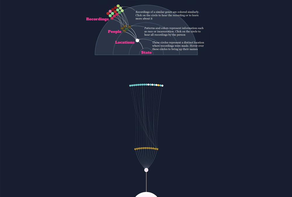
Organizing group Jobs for Justice and UnionBase have created an interactive website that allows co-workers to post pictures of the deceased as a tribute. It's called the Worker's Memorial Wall. Maybe spend some time with it. Let the realities sink in. We must remember so we do not forget the path that brought us here.
That's all for today.
Stay safe,
- Ben
////////////////////////////////
Read

Museums Are Going Digital—and Borrowing From Data Viz in the Process
Maxene Graze shows how museums are starting to open up archives with the help of data visualization. Her blog takes influence from a 2015 research paper titled Generous Interfaces for Digital Cultural Collections, which is also worth a read. I think there’s huge potential for visualization and creative coding to make museum content more accessible, relevant, and interactive. An example: check out this experiment published by Google that merges Japanese scrolls with comic book panels.
Elsewhere
How to visualize a dataset with many messages: This is an incredibly insightful write-up of the design process behind creating a visualization that explores a large dataset with multiple messages. Felix Buchholz walks through the design steps made by his team to create an interactive exploration of 10 years of shareholder votes from big asset managers.
A brief history of "scrollytelling": if you've ever been befuddled by this viz-industry term, take a walk down memory lane with Bill Shander to see where it comes from (and where it could be heading).
Explore

A Landscape of Literature
I enjoyed stumbling upon this interactive article from Nimit Shah that analyzes his entire reading history using data from The Storygraph, an alternative to Goodreads. The use of overlapping curved area charts is smooth and subtle, which I think is a nice reflection on the softer subject of literature. He also developed a custom parallel-plot-meets-sankey combination (and you can view the code for it on Observable here.

The True Colors of America’s Political Spectrum Are Gray and Green
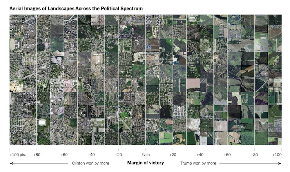
This idea is a brilliant take on the red/blue choropleth map we've all come to know and dread. By using machine learning to generate color palettes from satellite imagery, journalists created a new way to look at the rural/urban divide and how voters in these areas split in elections.
Elsewhere
Nicholas Rougeux published a new project that creates generative cityscapes from the title pages of influential books
RAWGraphs 2.0 is coming soon! Here's a preview of some new features.
Mask wearing in California: who's following the rules? Not many. My favorite part of this interactive piece is the "download your data" widget which allows the reader to do their own mask counting.
Currently obsessed with this weird bubble-to-packed-voronoi circle transition.
Here's an interesting primer for your next project: Every moon in our solar system, ranked.
Learn
A simple way to animate your SVGs
I used Vivus recently in a side project and loved it's simplicity. It's the kind of library that does a few things very well: take a static SVG and animate the lines.
Convert your CSS values from static to dynamic
Something I should really start doing more often. This is a good introduction to the practice of using things like "calc" to set CSS values.
Spread the love.
Share this edition of Data Curious.
Have a suggestion? Want to get in touch?
Fill out this quick form and I'll get back to you soon.
If you're not a subscriber yet to this newsletter, you can sign up .


