Who gets to stay home in NYC?
Data
Curious
2020.08.24
Hey,
I'll be taking some time off this week, so expect a short hiatus for new editions over the next week or two. But for this week, there are still some incredible stories and viz work to check out.
A quick follow up to a topic covered in : as suspected, the Trump administration's decision to shift data away from the CDC has resulted in delays and data problems. News broke yesterday that data reporting will be returned to CDC authority. It's good news, but at the cost of losing weeks of data accuracy and insight in the process.
To fight COVID-19, we need as much data transparency as possible. I'm encouraged by the amazing visualization work that's come out in response to the public health crises and hope the focus continues. This week's edition spotlights one of these recent pieces, including an in-depth look at how coronavirus has affected subway ridership in NYC.
Dive in.
Stay safe,
- Ben
////////////////////////////////
Read

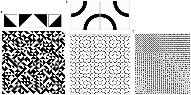
Infinitely Variable Tiling Patterns: From Truchet to Sol LeWitt Revisited
I really enjoyed learning about the history of repeating patterns in architecture from this piece in the science magazine Pattern. The fields of data visualization and creative coding have a lot to learn from architectural patterns, especially those produced programatically such as Truchet tiles and the line drawings of Sol LeWitt.
Explore

Who gets to stay home in NYC?
Spoiler alert: people in wealthy, predominantly white neighborhoods. This interactive scrollytelling piece from Two-N Studio breaks down MTA Fare data to reveal how inequities in the city affect who can avoid traveling by subway. Overall subway ridership dropped by 90% during peak coronavirus time, but the differences geographically are stark.
The piece combines smooth transitions, annotated maps, quad-scatterplots, and more to craft an important narrative. For those D3 nerds out there, the team used a combination of d3.js, raw JS, and the fabulous Scrollama library for scroll triggered transitions.

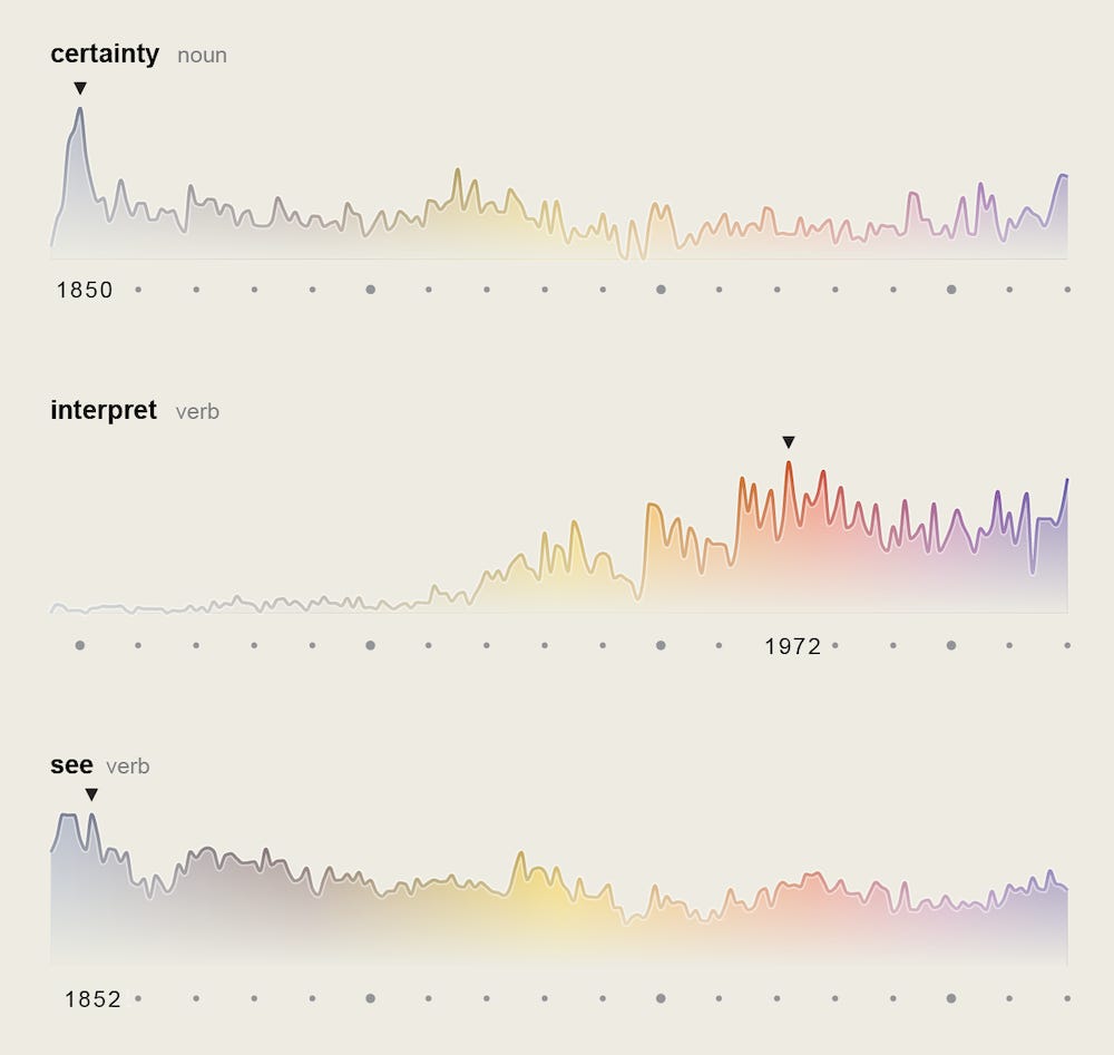
How has the language of Science changed?
Scientific American published an interactive tool that explores how the language used by the magazine has evolved over the past 175 years. The hugely ambitious project was led by data viz creative Moritz Stefaner and contains both an interactive page and a stunning print edition. I love the gradient color scheme fading from brown to modern purple through time.
For the real nerds out there, Moritz also wrote up an explanation on how he parsed text from 5,107 issues of the magazine and created the visualizations with a suite of tools and packages. For even more behind the scenes looks, check out this Twitter thread too.
Learn
5 Vue libraries to check out
In the past year I've started using Vue for a lot of my dev projects. This article has a few libraries I haven't heard of with helpful tools for things like date pickers and modals. Seems useful.
7 ways to visualize Likert data
Ah yes, the Likert scale. Beloved by all survey writers everywhere. From a visual perspecritve, it can get boring though. Here are a few ways to think about them differently.
Spread the love.
Share this edition of Data Curious.
Have a suggestion? Want to get in touch?
Fill out this quick form and I'll get back to you soon.
If you're not a subscriber yet to this newsletter, you can sign up .


