How and why to make a data-driven story
Data
Curious
2020.08.17
Hey,
This week's edition is jam-packed with goodies. Normally I try to keep it to 1-2 links per section, but there was just too much to fit in. So enjoy the extras!
Stay safe,
- Ben
////////////////////////////////
Read

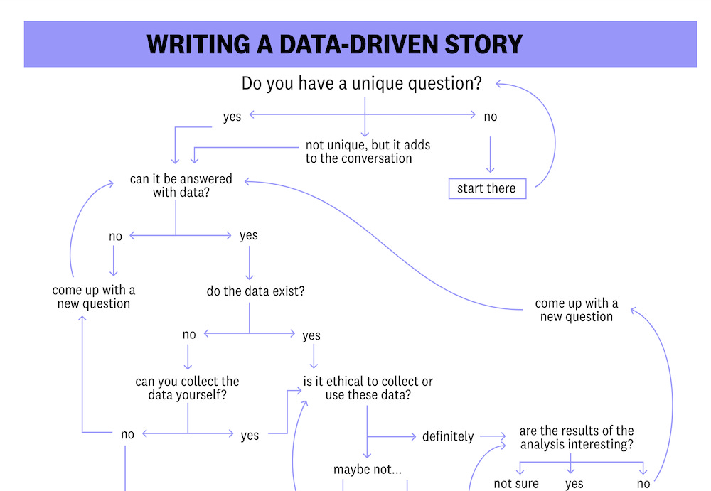
A behind-the-scenes look at the process behind making data-driven stories
I've included a fair amount of links from visual essay site The Pudding in this newsletter, and for good reason. So I was naturally excited to read an open look into their process for creating data-driven stories. This article unveils the process of creating a piece from data collection, investigation, cleaning, visualizing, prototyping, all the way to the finish. It's an insightful read that applies to all kinds of data analysis and visualization, not just this method of storytelling.
And if you're looking for more "behind the scenes" type stuff, I found this write-up from recent The Pudding contributor Erin Davis really interesting. She writes about her personal experience of pitching as a freelancer and the steps she took to bring her idea to life. Check it out here.
Elsewhere
Our World in Data published a new article showing that, when it comes to reducing your carbon footprint, what you eat matters more than where it comes from. The data and charts are great, but in summary: "...going ‘red meat and dairy-free’ (not totally meat-free) one day per week would achieve the same as having a diet with zero food miles."
Ever wonder how a team of data journalists come up with election charts? This thread. This is how.
On a related note, I found a thread from Jessica Hullman (publishes research on uncertainty in visualization) that reviews the efficacy of the plots from the FiveThirtyEight election tracker. Fascinating.
The NYT has been making a lot of maps lately (COVID, elections, protests, etc). This thread shows a trick they have used to implement clearer visualization of county-level mapping by omitting the shading of certain low-impact areas.
Will Chase wrote an article about his experience building a data viz career as a freelancer, from building a portfolio to finding new work.
Explore

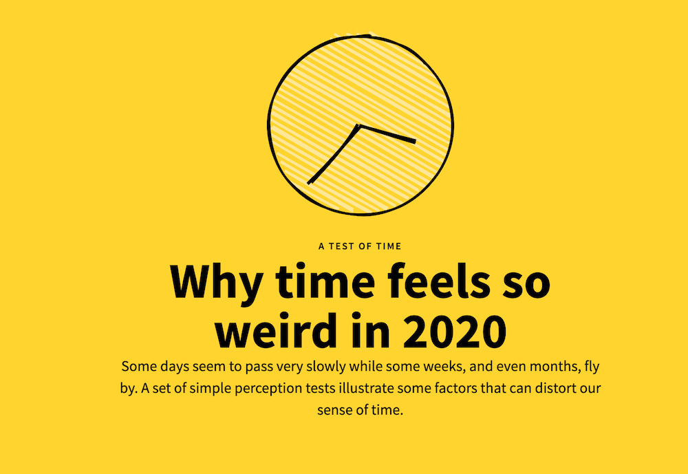
Why does time feel so weird in 2020?
While this is not technically data visualization, I loved it too much to not include. A series of simple illustrations and simulations explain why this year, it feels like it's eternally March.

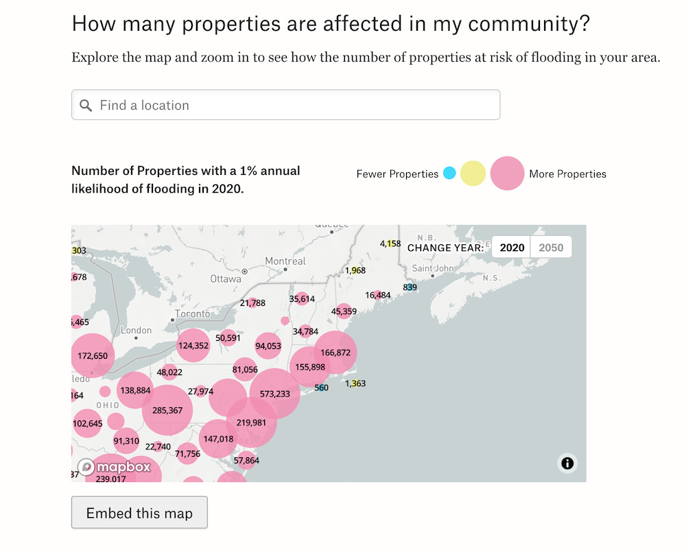
How is flooding affecting your community?
Another really good example of visualizing flood data from the study released earlier this summer. This one has some nice features that the NYT version from a few weeks back didn't include like "Embed this Map" button for easy interactive sharing, visualizing properties as clustered bubbles, animated flood maps, and the ability to create your own GIF animation based on any location in the map. Genius!
Elsewhere
Newsletter fatigue is real. The Pudding is here to help you get the best of the best by curating the curators with a new data-driven newsletter of the top-ranked links each week.
In a new creative coding experiment with Google, Explore the Ocean of Books to find your favourite authors’ islands and discover similar ones near them.
Yet another COVID simulation from Harry Stevens of The Washington Post. This one shows why attempting herd immunity without a vaccine is a bad idea.
In America, how long you live depends on the color of your skin. This scrollytelling op-ed from the NYT shows the data behind health outcomes of racial minorities.
Led by Jason Forrest, the team at Mckinsey have released a new COVID unemployment tracking dashboard.
Learn
Stacked bar charts in D3
Learn how to use d3.stack to format your data into groups for stacked visualizations.
Faster data cleaning in Python
Speed up the pre-processing step with a new package called klib.
Visualize "the nothing"
Combine Pandas, Missingno, and Matplotlib to create plots revealing missing data in Python.
How to improve SVG mapchart shape rendering
Give your SVG shapes a more polished feel with this small trick.
Spread the love.
Share this edition of Data Curious.
Have a suggestion? Want to get in touch?
Fill out this quick form and I'll get back to you soon.
If you're not a subscriber yet to this newsletter, you can sign up .


