Alt text for data visualization
Data
Curious
2020.08.03
Hey,
There are two cool things I want to mention (I didn't know where to put them, so just leading with them here).
1. Glitch is one of my favorite tools for spinning up quick websites and apps for sharing. They just announced that "static sites" will stay live instead of going to sleep, which is a huge plus for doing small side projects! No hosting required.
2. I think this has been a thing for a long time, but I never thought about customizing by Github README profile until reading this article. Think I'm due for an upgrade with some Markdown/inline-CSS magic.
That's it. On to the links: this edition has some real gems in the Explore section!
Stay safe,
- Ben
////////////////////////////////
Read

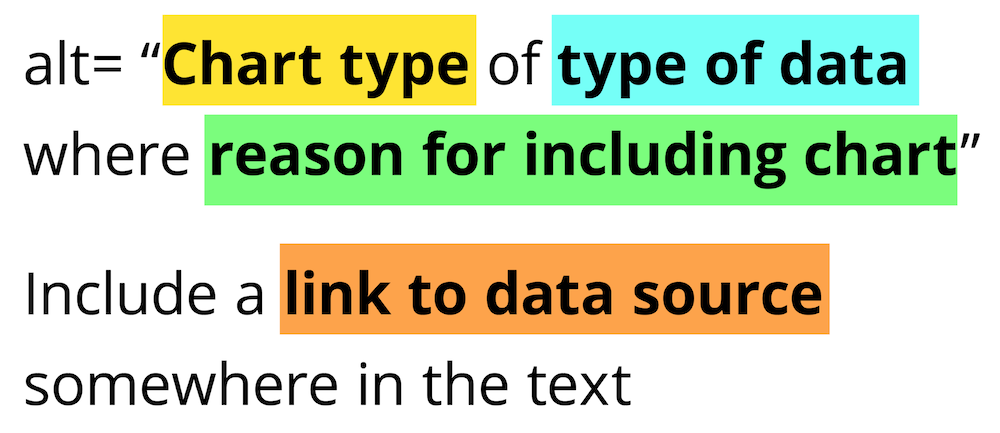
Writing Alt Text for Data Visualization
Data Visualization is inherently biased to be difficult for the visually impaired. Due to its complexity, some people don't even try to include alt text for charts. This article introduces a really helpful starting point as a formula for making your visualizations more accessible. As author Amy Cesal puts it:
"You probably can’t write text that conveys the entire meaning of a chart. But, that doesn’t mean that you shouldn’t try."
Explore

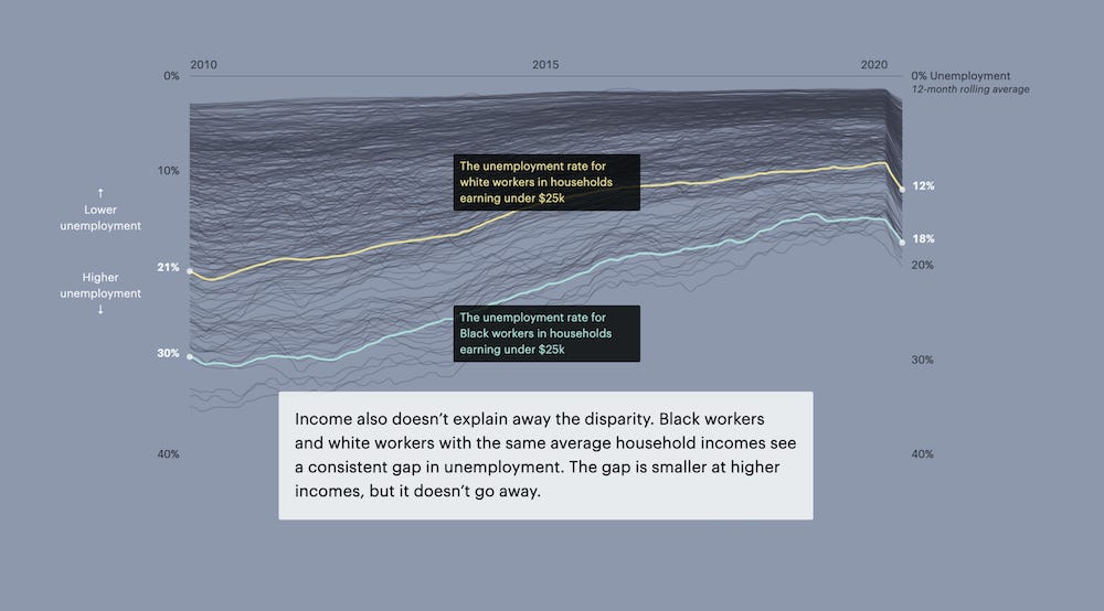
What Coronavirus Job Losses Reveal About Racism in America
Unemployment rates for Black Americans have averaged at twice the rate of white workers. Even when looking at families with the same income level, the disparity persists.

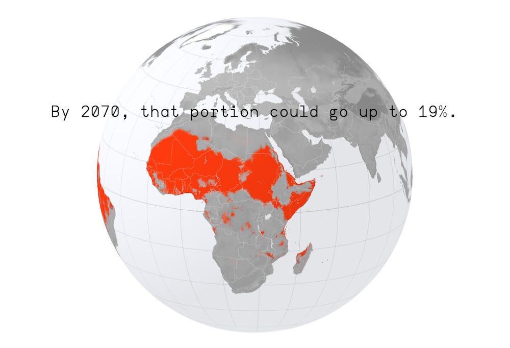
The Great Climate Migration Has Begun
This is one of the best introductions to a data-driven story I've seen. Simple and effective. New research suggests climate change will cause humans to move in unprecedented numbers. The Times Magazine partnered with ProPublica and data scientists to understand how.
Elsewhere
Astrophysicists created the largest 3d map of the universe, visualizing 11 billion years of expansion.
What did cities sound like during lockdown? Senseable City Lab visualized the soundscape at five city parks to find out.
If you're looking to escape the news happening in the world (literally), check out this scrolling interactive of the solar system by the NYT.
What happens when your goal is to craft a "flipped open data portal", where people & stories come before the data? The result: an open data portal for Matera's European Capital of Culture. This is how the front page of all open data portals should look.
Learn
Databases in Python
Create a SQLite database in Python with sqlite3.
Treemaps in Python
Make treemaps in Python with Squarify.
Learn Javascript for cheap
Humble Bundle is running a huge Javascript bundle with tons books and tutorials. Pay what you want, or upgrade to a paid bundle for extra goodies.
Spread the love.
Share this edition of Data Curious.
Have a suggestion? Want to get in touch?
Fill out this quick form and I'll get back to you soon.
If you're not a subscriber yet to this newsletter, you can sign up .


