Data should be public
Data
Curious
2020.07.13
Hey,
As someone who works with data at least 5+ days per week, this past week had me worried. On Wednesday, the Trump administration ordered hospitals to stop sending data to the CDC. Instead, they will send all coronavirus patient information to a database in D.C. Health experts are worried, as this seems like a political tactic to try to pad the numbers.
If you work with databases at all, you know how much of a headache migrating systems can be. More importantly, the access of open data in a health crisis is absolutely crucial. Data should be public.
It's too soon to tell how the new data reporting system will work. But the reason I bring it up is this: we are reminded once again how access to data, understanding of data, and reading data correctly has become a central issue in this pandemic. What we do as data visualizers and data scientists has enormous impact.
Stay safe,
- Ben
////////////////////////////////
Read

How to Tell Stories with Data in an Unfolding Global Pandemic
The Surgo Foundation has been creating interactive visualization tools and stories since the start of the COVID-19 pandemic. In this blog post, they share what their team has learned during the process so far about how to visualize this data responsibly and effectively.
Explore

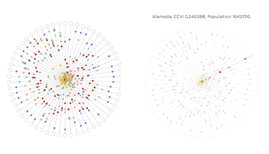
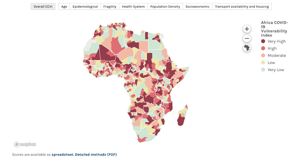
The COVID-19 Community Vulnerability Index
Again, from the Surgo Foundation, this page contains a series of beautifully crafted maps and visualizations showing an important yet under-reported metric: a new calculated score to measure a community's "vulnerability" to the pandemic. This vulnerability score can be applied across a range of indicators such as fragility, health systems, economic indicators, and more. You can also download the spreadsheet with scores for Africa here.
Elsewhere
I loved this creative coding experiment that uses the "paintbrush" technique to manipulate pulsating dots.
Explore Explain is a new (ish) podcast series from Andy Kirk on design and data visualization. This episode in particular features an interview with Jan Tulp who designed and built the 3d sphere visulaization for Dutch railways (featured a few months ago in this newsletter!).
If you're looking for inspiration, add these titles on how to better communicate with data to your bookshelf.
Learn
What is Tidy Data?
The principle of Tidy Data is incredibly useful when visualizing data. This tutorial will get you started with the Pandas pivot and melt functions to prep data for plotting.
Exporting charts from web-based Python viz libraries
Exporting static plots has long-been a frustration for many Python visualization libraries (except for Altair which does this out-of-the-box...thanks Jake!). Now, a new library called Kaleido will allow you to generate static PNGs or vector SVGs from web-based visualization libraries like Plotly.
Spread the love.
Share this edition of Data Curious.
Have a suggestion? Want to get in touch?
Fill out this quick form and I'll get back to you soon.
If you're not a subscriber yet to this newsletter, you can sign up .


