Interaction as data visualization
Data
Curious
2020.07.13
Hello,
Sometimes I use this front matter to preview the content below. Other times, I share what's on my mind. Today I'd like to follow up on last week's Black Lives Matter edition.
It is a difficult time to take a global perspective. With so many urgent problems around racial inequality happening at home, some days it feels like this is all we should be talking about right now.
We also live in a world of interconnected problems. We cannot speak against racial injustice without also confronting issues of economic inequality, cost of education, housing rights, and on and on.
All that to say, essentially this: I am committed to including pieces of data visualization that touch on these issues, accepting that not every issue will be representative of a single struggle.
To that end, I want to include a notable update to last week's content: since last week's edition, the NYT published an interactive piece highlighting the racial inequalities of coronavirus across the US. Across the country, Black and Latinx are nearly 3x as likely to contract the virus and nearly 2x as likely to die from it compared to White Americans.
This work was only possible because the NYT sued the CDC to release demographic data. If you want a good behind-the-scenes look at how data journalists do this work, I highly recommend this edition of The Daily podcast which describes the process of getting and analyzing the data for these stories.
And now, onto this week's edition.
Stay safe,
- Ben
////////////////////////////////
Read

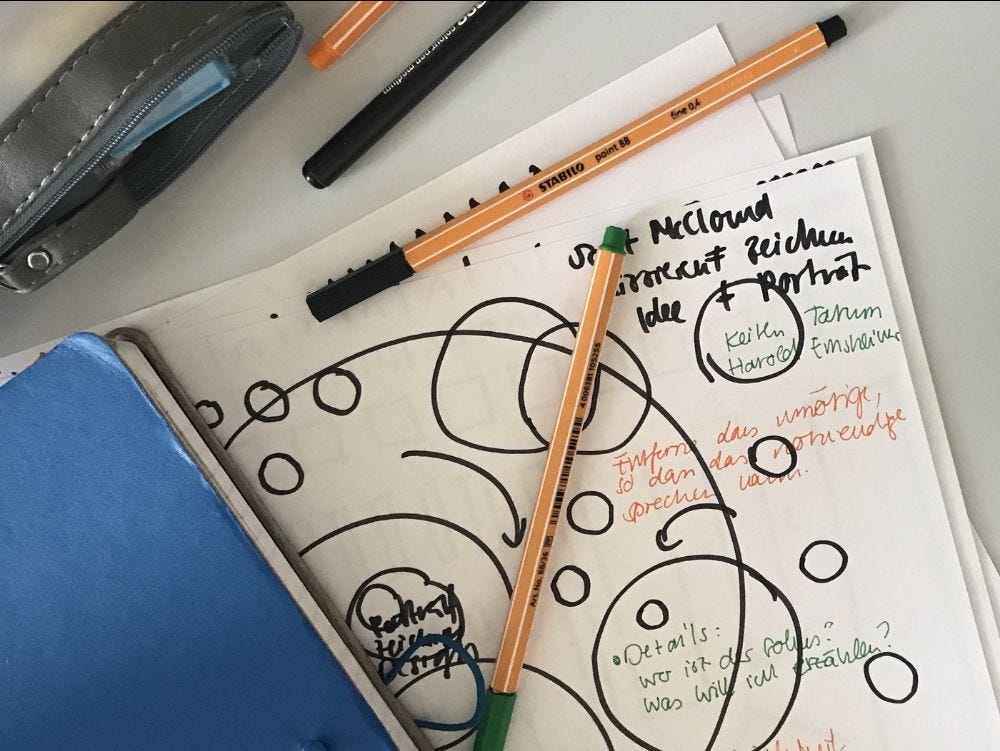
Using pen and paper to draw a compelling data interface
A fascinating exploration of data visualization through the lense of interaction design. There are lots of interesting concepts here for designing better interfaces for exploring data, but I'll highlight one quote here specifically that I love (emphasis added mine):
"The user interface of an interactive data visualization is often realized as a collection of widgets that enable users to manipulate individual indicators or data views. This kind of interface provides a certain amount of control, but it feels like it was slapped on in the last stage of the design process. And even if the widgets are well designed, they cannot hide the fact that they separate the user from the visualization. Conceptually, the design of the visual representation and the design of the interaction with the data are often treated as two different questions. And that is a problem."
Explore

Complexity Explorables
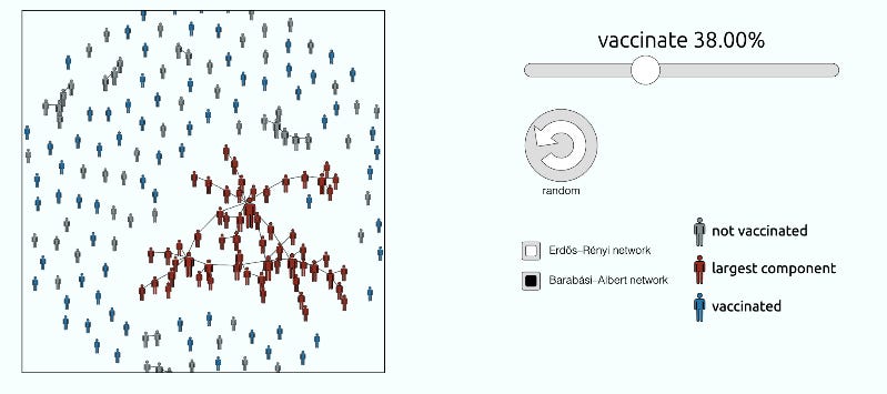
Wow this collection of explorable interactives by Dirk Brockmann is incredible. It's a mix of data viz and creative coding to explore complex systems in biology, physics, math, epidmiology and more! I particularly liked this one on vaccinations and this one on the preferential attachment model of networks.

A future without cars
Farhad Manjoo has seen a future NYC without cars. He will show them to you with these cool 3d maps.
Elsewhere
a design studio visualized the wind patterns of NYC to create a "Wind Data Painting"
Reuters Graphics asks the question "how far is far enough?" in their piece visualizing social distance during coronavirus.
A new project from Moritz Stefaner highlights research connections between scientists in autism research
And, new data reveals where in America is most likely to flood
Learn
Scrollytelling with GSAP
Add smooth animated transitions to your next scrollytelling data viz with this Javascript library tutorial from Will Chase.
Create interactive reports from a Jupyter Notebook
DataPane is a new Python library that allows you to export a data analysis into an interactive, explorable SPA.
Animated force fields with Clojure
Inspired by the legendary "Making it Big" piece from The Pudding, Thomas Sojka set out to learn how to recreate the particle orbit using the Clojure programming language. If you're not interested in that library, the write-up is still worth a read just to see the process of "stealing as learning".
Spread the love.
Share this edition of Data Curious.
Have a suggestion? Want to get in touch?
Fill out this quick form and I'll get back to you soon.
If you're not a subscriber yet to this newsletter, you can sign up .


