Data visualization for Black Lives Matter
Data
Curious
8 minutes and 46 seconds.
3x more likely to be killed by police.
Median wealth gaps of a degree of 10x and more.
Like Coronavirus, the Black Lives Matter movement is a story of numbers. More importantly, it's a story of the people behind the numbers.
This is a crucial moment to understand the scope of our American problem: how a system of racism has evolved over time to shape our society today. It was built by white people and it is preserved by white people against Black and Brown bodies.
As a white person, I am learning. I am watching. And often, the best way I learn is by starting with the numbers. So this special issue will focus exclusively on understanding racial inequities in the United States through the practice of data visualization.
I cannot capture the full extent of our nation's oldest problem. But if you're looking for places to dive deeper, hopefully, this can help as a place to start. There are many, many data viz stories out there to discover, and these are only a few.
We cannot work towards a just society for all until we understand the injustice around us.
- Ben
////////////////////////////////
Charts and Stories

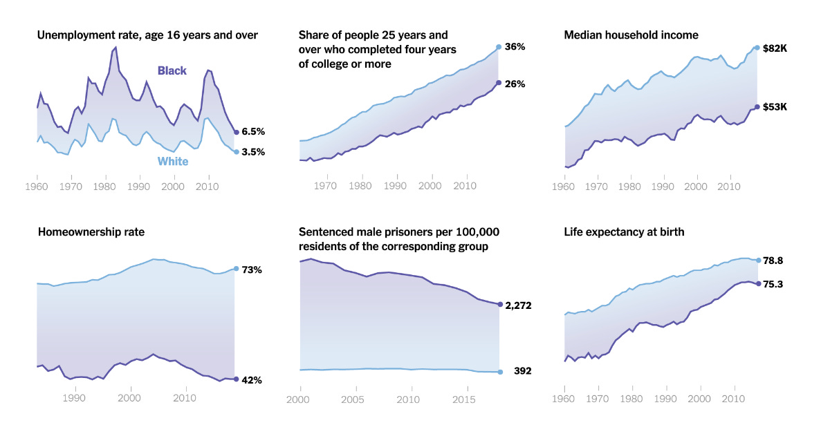
The Gaps between White and Black America, In Charts
American inequality between black and white people exist across sectors: education, wealth, safety, health outcomes. This interactive piece shows just how far the gap can be in cities across America.

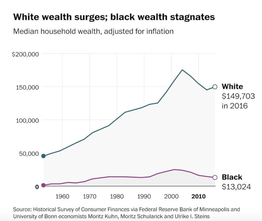
White wealth has surged steadily, while black wealth stagnates
The economic divide is the same as it was in 1968.

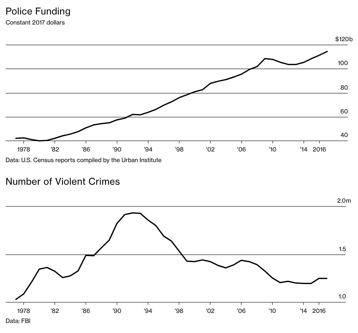
Crime has fallen. Police budgets continue to rise.
Violent crimes specifically have dropped dramatically since the 90s, but police funding goes up almost every year. Across the country, the funding as a percentage of state and local government spending has remained largely unchanged.

In Minneapolis, police used force at a rate 7 times higher than against whites
20% of the population is black. But confrontations with police where officers kick, shove, user a taser, strangle, etc. a black person make up 60% of all such confrontations. This is not just in "high-crime" neighborhoods either: "black people are also subject to police force more often than white people in some mostly white and wealthy neighborhoods".
Data and Numbers
Police are responding to Black Lives Matter protests with excessive violence, and people are filming it. Organizers have been documenting the videos in this spreadsheet.
Public opinion has risen at a remarkable rate in favor of the Black Lives Matter movement. Over the last two weeks, support for Black Lives Matter increased by nearly as much as it had over the previous two years. The Civiqs poll data is here.
Black people are 3x more likely to be killed by a police officer than white people. In 2019, Black people were 24% of those killed despite being only 13% of the population. View the full database here.
Smartphone Data Show Voters in Black Neighborhoods Wait Longer..."voters in predominantly black neighborhoods waited 29 percent longer, on average, than those in white neighborhoods. They were also about 74 percent more likely to wait for more than half an hour."
For the past 5 years, the Washington Post has been compiling a database of police shootings.
America’s policing budget has almost tripled since 1977 to $115 billion.
The median wealth of white households is now 10 times higher than the median wealth of black households. In 1992, the multiple was seven to one. Data from Kaiser Family Insititue.
If you're looking for more data creating to Black Lives Matter protests, I highly recommend this edition of Data is Plural, the excellent newsletter from data journalist Jeremy Singer-Vine.
Spread the love.
Share this edition of Data Curious.
Have a suggestion? Want to get in touch?
Fill out this quick form and I'll get back to you soon.
If you're not a subscriber yet to this newsletter, you can sign up .


