Visualizing categorical data and how to make better timelines
Data
Curious
2020.05.12
Hello!
It's been a few weeks. I'm feeling the collective *oof* of being on lockdown for over 2 months now. And sometimes that means being far less productive than my former self.
That's ok for now. On the upside, it does mean you get a supercharged edition of the newsletter this week. Lots of extra links, and a couple of amazing tutorials to learn new skills at the end.
That's all I got. I'll try to be back with some more links in two weeks time.
Stay safe and stay home,
- Ben
////////////////////////////////
Read

An overview of categorical data visualization
I found this Medium post really helpful as a way to stretch the boundaries of visualizing categorical data. Bar charts are clear, but sometimes you need to show something more: try arc diagrams, chord diagrams, or a sunburst.
Elsewhere...
- Timelines are not always lines: here are other ways you can visualize time series data
- Six environmental visualizations for Earth day
- New research from IEEE on how to encourage engagement and exploration with data viz
- How long will a vaccine really take?
- A retrospective on how (and why) to combine a bubble chart with a dendrogram
Explore

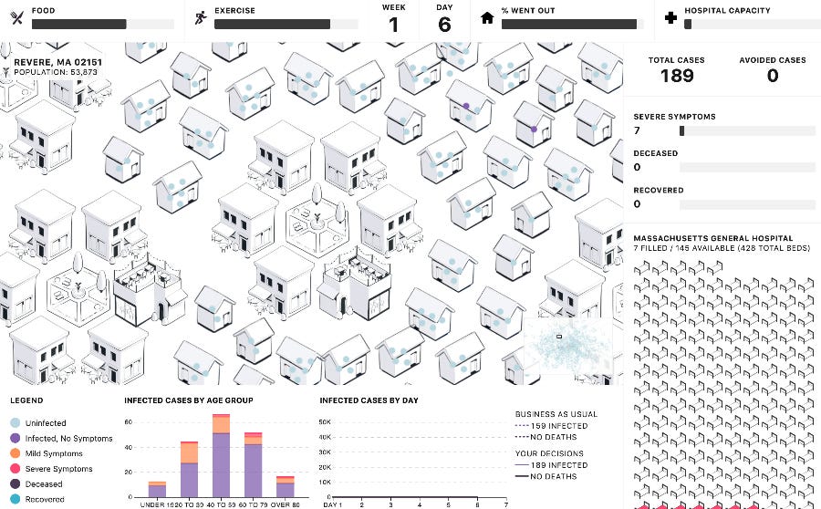
People of the Pandemic Simulation
Data visualization designer and engineer Shirley Wu created a pandemic simulation game full of charts, illustrations, and projections. This is one of the most impactful simulations I've seen: it feels accessible and not too technical, while also communicating the gravity of the issue. Stay at home.
Other cool stuff I stumbled upon...
- Project Aurora: a suite of data-driven visualization tools for analyzing conversations and communities on Twitter
- A migrant's contribution to the fight against COVID-19 is so beautifully designed
- Groovescape: Experience your Spotify listening habits visually
Learn
An open source, low-code library for machine learning
Introducing PyCaret 1.0.0. for people who want to do some ML, but don't want to make their own models.
Tiny shaded bar charts in D3
An Observable notebook to get you up and running.
Interactive Graph Visualization in Jupyter with ipycytoscape
Visualize connections and clusters with interactivity all inside a notebook.
Speed up your D3 force spirals
Wow! What a godsend. Love a good force layout, but mine are usually painfully slow. Super charge your loading time with this new tutorial from Wattenberger.
Spread the love.
Share this edition of Data Curious.
And say hello! I'm on:
Have a suggestion? Want to get in touch?
Fill out this quick form and I'll get back to you soon.
If you're not a subscriber yet to this newsletter, you can sign up .


