In charts: America will struggle after the coronavirus
Data
Curious
2020.03.30
It's another week, similar to the last week. Time has a funny way of blending together these days.
I missed last week's newsletter, but I'm back this week with some interesting pieces to explore. That's all for now.
Stay safe out there,
- Ben
////////////////////////////////
Read

Being Bayesian with Visualization
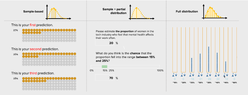
Visualization researchers Jessica Hullman and Yea Seul published research on the role that prior beliefs play in people's ability to read a data visualization. They show how "applying a Bayesian framework to visualization interaction provides a more powerful way to diagnose biases in people’s interactions with data", with plenty of fascinating examples along the way.
Lessons from China's COVID-19 Visualizations
Kevin Maher interviewed three data visualization practitioners who emerged as leading voices in sharing data around China's outbreak through smart visualization. This is what they learned, through three different approaches to this challenge.
Explore

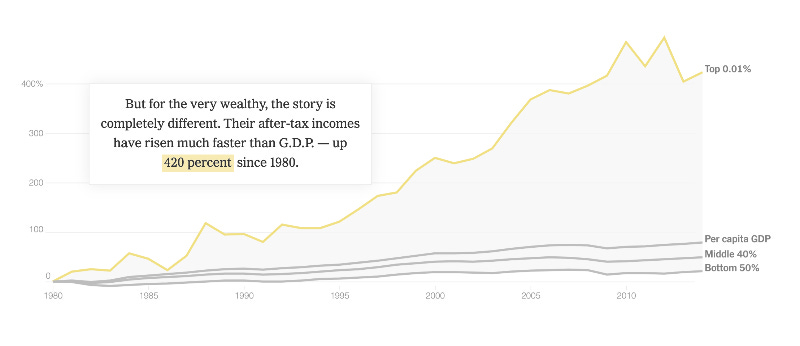
America Will Struggle After Coronavirus. These Charts Show Why.
As part of their new series "The America We Need" the NYT takes a look at why America may struggle more than other countries in a post-coronavirus world. These statistics have been visible for a long time, but now appear even more stark in their contrast.
Take the screenshot above: compared to per capita GDP, the very wealthy have seen a 420% increase in wealth since 1980. The bottom 50% have seen just 20% increase. This gap of inequality is driven by wealth inequality, but it spreads into other areas of life: education, health outcomes, job security. These charts do a phenomenal job of telling this very important story.
Learn
Interactive brush-to-filter data visualizations with Altair
This tutorial gives a good introduction to implementing brush-to-filter interactions across multiple plots in the Altair visualization library.
Creating beautiful maps in Python: Going beyond the defaults
I liked this simple yet effective tutorial on adding some color and styling to basemaps with Geopandas.
Spread the love.
Share this edition of Data Curious.
And say hello! I'm on:
Have a suggestion? Want to get in touch?
Fill out this quick form and I'll get back to you soon.
If you're not a subscriber yet to this newsletter, you can sign up .


