Write some bad code
Data
Curious
2020.03.30
Everything feels uncertain. Things are changing fast. So maybe, just maybe, it's ok if you don't use all your spare time to start your next project.
This is a line I have start reciting to myself. With more time at home than ever before, creators everywhere are feeling the pressure to put something out into the world.
But sometimes it's ok to take a break; to fiddle around with something just for fun.
Sometimes it's ok to write bad code.
My favorite discovery from last week was a blog on this very topic from Glitch (link below). I have a huge backlog of side projects. Many will never see the light of day.
But instead of beating myself up over it, why not use what I can? Everything is learning. It's ok to make something and then never share it with the world.
I hope you can find some things to stimulate your mind this week. Go write some bad code, and learn from it.
Stay safe out there,
- Ben
////////////////////////////////
Read

An Ode to Unfinished Projects: Learning to Love "Bad Code"
I really loved stumbling upon this blog post on the Glitch website. Never used Glitch before? It's a browser-based coding tool much like Codepen, but way more fun and way more indie. You can discover and remix all sorts of fun little apps on the site.
As we spend more time at home, this blog was a great reminder that unfinished projects don't have to be a badge of shame. Revisit it, or don't: it's your creation! As Melissa McEwen elegantly puts: "Stigma against “bad code” is bad for coding culture, and I should extend that compassion to myself."
What to Read, Watch, and Listen to During Social Distancing
The Nightingale has assembled a starter kit for how to feed your data viz curiosity while social distancing. The article contains links to podcasts, TV shows, documentaries, and books that relate to designing with data in some way.
Explore

When should we stop social distancing?
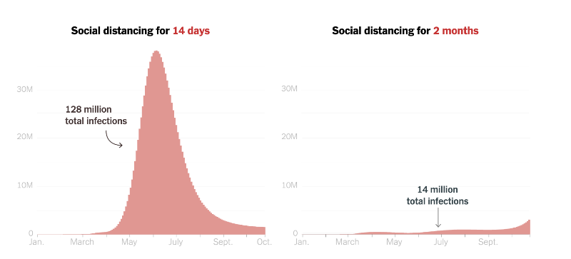
According to epidemiologists and mathematicians, not anytime soon. After Trump first announced that he wanted to "reopen America" by Easter (which he has since walked back, at time of publishing this newsletter), the NYT released a simulation that allows the user to explore how infections and deaths differ based on the number of days of social distancing. The interactive slider really hits this home, as you can drag to see the difference day-by-day.

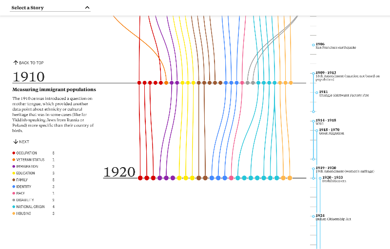
How has the census changed since 1790?
Have you filled out the 2020 census yet? If not, get to it. The census remains one of the most important data collection practices in American democracy. The Pudding analyzed how the questions have changed since the beginning: "They depict an evolving country: a modernizing economy, a diversifying population, an imperfect but expanding set of civil and human rights, and a growing list of armed conflicts in its memory. What themes and trends will you notice?"
Learn
Create a proximity graph animation in Javascript
This tutorial walks you through how to create a slick animation of points connected by lines in pure JS + Canvas.
Chartify: A new chart library from Spotify
Spotify announced the release of their new charting library for data science in Python. It's open source and built on top of Bokeh.
Spread the love.
Share this edition of Data Curious.
And say hello! I'm on:
Have a suggestion? Want to get in touch?
Fill out this quick form and I'll get back to you soon.
If you're not a subscriber yet to this newsletter, you can sign up .


