The Coronavirus Issue: Resources for responsible data visualization
Data
Curious
2020.03.16
As people who practice data visualization, public health emergencies such as this one bring up a weighty reminder: we have a responsibility to visualize, communicate, and translate data accurately.
Because people are scared. Because people are spending more time online searching for answers than ever before. Because lives are on the line.
In normal weeks, I try to spread my links across useful things to read, explore, and learn. This week is different. This week I’m focusing on resources we can use as a visualization community in our global fight against coronavirus.
We must partner with scientists, epidemiologists, public health experts and doctors to accurately convey the message in this data. The disease is spreading, it’s dangerous, and we can do something to contain it.
Now is the time to make sure we, as a society, are collectively understanding the challenge ahead of us. Data visualization will be a key component in making this happen.
- Ben
////////////////////////////////
Read these first

10 considerations before you create another chart about COVID-19
If you are considering diving into the data yourself, I encourage you to start here. It’s written by Amanda Makulec who in addition to being a data visualization lead, holds a Masters of Public Health from the Boston University School of Public Health. As someone with expertise in both fields, we should be looking to voices like hers for guidance.
Coronavirus: Why you must act now
If you haven’t already, I encourage you to take some time with this deep dive into coronavirus data by Thomas Pueyo as a good introduction to the scope of our problem (with plenty of charts along the way).
Mapping coronavirus, responsibly
ESRI has contributed to creating some data viz guidelines by publishing an article about responsible mapping in the time of coronavirus.
A coronavirus data resource hub
Tableau has teamed up with Johns Hopkins University to create a COVID-19 Data Hub. This page has few Tableau dashboards of the data (some are useful, but see further down for some better explainers). It also has links to accurate data sources at the bottom, including a database of scientific findings about coronavirus, the Johns Hopkins University database, and simulation code on Github on how the disease might continue to spread.'
Elsewhere
A tweet thread by Evan Peck contains some good recommendations on how existing viz can improve. The basic problem with the visualizations we are seeing is this: “None of them are necessarily wrong, but they tell different stories.” We need to make sure that the right stories are being told.
Among some of his useful tips are to avoid using log scales for time series charts (because it looks like containment is happening, even when it’s not).
Visuals to explore

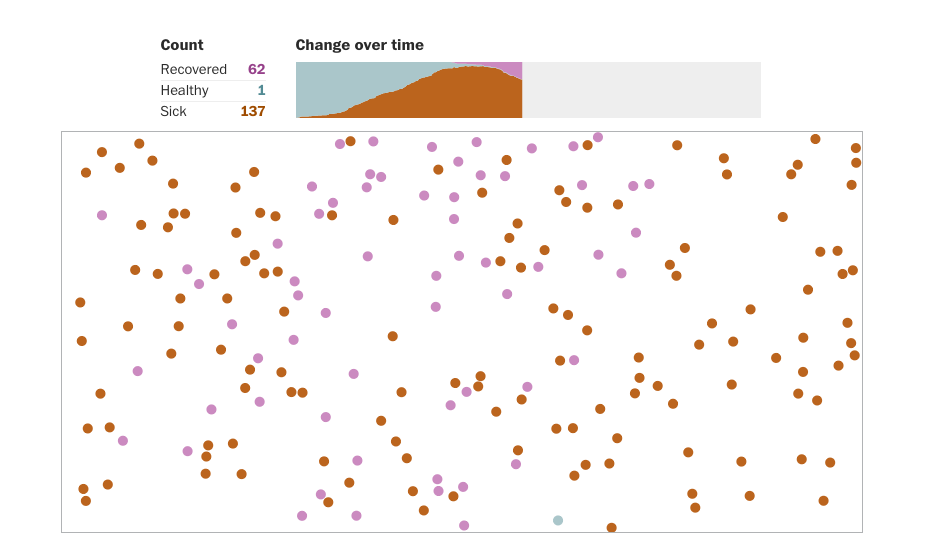
Why outbreaks like coronavirus spread exponentially, and how to “flatten the curve”
Harry Stevens from The Washington Post published this fantastic explainer on why outbreaks like coronavirus spread exponentially, and how to “flatten the curve”. This is perhaps the best resource I have seen yet that visually explains the dangerous spread of this disease through charts and interactive simulations. Barack Obama even retweeted the story as a must-watch, which according to NYT editor Stuart Thompson, is about as close as data visualization gets to winning a Pulitzer.
To flatten the curve, we need to act quickly.
The NYT published a scrolly viz story to explain “flattening the curve” with mathematical simulations of different paths forward. This is a great way to bring this reality to life, especially given that speed of action seems to be the most important factor.
Who is most at risk for coronavirus?
This scrolly scatter plot models occupations at the greatest risk based on how often a worker is exposed to the virus (y-axis) and their physical proximity to people who could be positive (x-axis).
Quick explainers on flattening the curve:
In my opinion, this the best illustrated version (with quotes) of how we can flatten the curve together is below. It’s best to use with people who may not be familiar with the concept
Here’s the difference between taking early action for lockdowns (green line) and waiting two weeks later (red line).
Most people I know find the flattening the curve graphic intuitive and helpful. But believe it or now, some people just really don’t like graphs. They might even have an aversion to them. Now is the time we make sure data visualization is interesting and accessible to all. And sometimes that means drawing a cat on a graph.
Live visualizations to use and share
Datawrapper has assembled 17 responsible live visualizations about the coronavirus for you to use. The charts and maps use Johns Hopkins and W.H.O. official data sources.
The NYT has been tracking the outbreak throughout multiple articles, but this page contains the most useful live data visualizations and maps. Note: the NYT has removed their paywall for all coronavirus coverage, so it’s free to access by anyone.
The Washington Post has also removed their paywall for coronavirus coverage. You can access their maps with data table tracking here.
For dashboard tracking of the virus, I encourage you to go straight to the source: use Johns Hopkins live updating dashboard or this one from the W.H.O.
Spread the love.
Share this edition of Data Curious.
And say hello! I'm on:
Have a suggestion? Want to get in touch?
Fill out this quick form and I'll get back to you soon.
If you're not a subscriber yet to this newsletter, you can sign up .


