Map responsibly
Data
Curious
2020.03.09
Hello,
COVID-19 continues to spread across the world. In terms of communication and awareness, data visualization is once again taking center-stage in the public conversation.
Just like during election season, we've seen the spread of misleading maps and charts that spread unnecessary amounts of fear. So much so that global publishers like the BBC have had to write specific articles to refute it.
As warnings continue to spread, we have an obligation to point people to the best sources. This map dashboard from Johns Hopkins is a good one to fall back on.
Data visualization holds enormous potential to inform, and misinform. Let's make sure we use our tools responsibly.
- Ben
////////////////////////////////

Viz of the week
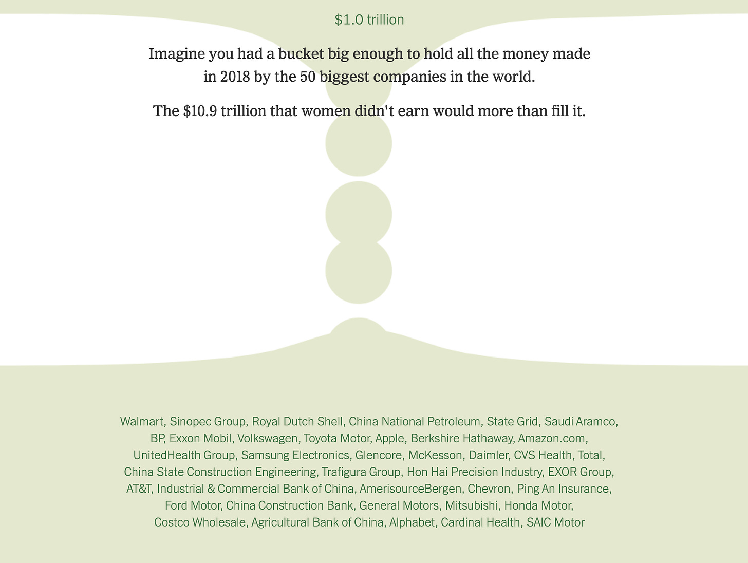
The NYT released an opinion piece with a shocking calculation last week: women’s unpaid labor is worth $10,900,000,000,000. There are multiple great visualization shere, but my favorite is this treemap which converts into falling bubbles. Love how they really took the "drop in a bucket" metaphor literally here by comparing the amount of huge Fortune 500 companies to this staggering amount of $10.9 trillion.
Words to read

9 best practices when designing a dashboard
Designing a dashboard takes a lot of UX thinking. This article gives a few high-level tips (though it's heavier on the design side than dev). Here's my favorite: "keep in mind that a user will be willing to spend five seconds to find the information they need."
How to create simple and clear user experiences with Hick’s Law
This UX article got me thinking about how to apply Hick's Law to data viz and charts, especially the principle of reducing the number of options to users to avoid "information fatigue".
A Dataset is a Worldview
A fascinating read on subjective data, why datasets should expire, & data sabotage. Love this concept.
Visuals to explore

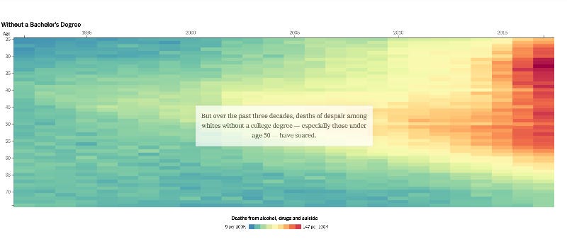
How Working-Class Life Is Killing Americans, in Charts
Wow. This thread of charts from the interactive story is astounding, and so important for understanding our political moment.
We Read 150 Privacy Policies. They Were an Incomprehensible Disaster.
This one is an oldie, but I just rediscovered it and gave it a proper scroll-through last week. Takeaway? Privacy policies are a complete mess. The data storytelling using a sticky scatterplot with transitions is on point in picking apart how companeis obscure their policies with unnecessarily jargn-filled statements.
Elsewhere:
Where did all the Hillary voters go? Check this quad-scatter plot from Politico to see voter sway.
The Climate Policy Database contains 3,867 policies from 193 countries. They are all open to download and analyze (h/t to Jeremy Singer-Vine and his Data is Plural newsletter).
If you want one chart to summarize how to respond to COVID-19 news, this is a good start.
Things to learn
Learn HiPlot — Facebook’s Python Library for Machine Learning Visualizations
I fiddled around with HiPlot last week and loved how easy it was to get off the ground. Really useful for hyperparameter tuning in ML experiments.
Generate CSS on the fly
Hate fiddling around with CSS to get the UI you want? Use this simple little tool to style elements with a WYSIWYG editor and copy the styles.
A Javascript Framework Chart
Should you be using a Javascript framework? Not necessarliy. This chart (dare I say, framework) can help you decide. And if you do want to use one, here are 11 frameworks to choose from.
Advanced Data Clustering
Dive into K-means clustering and visualization with this tutorial.
Spread the love.
Share this edition of Data Curious.
And say hello! I'm on:
Have a suggestion? Want to get in touch?
Fill out this quick form and I'll get back to you soon.
If you're not a subscriber yet to this newsletter, you can sign up .


