Break some rules in your next data visualization
Data
Curious
2020.03.02
Hey,
Working on some deadlines this week so I'll keep it short. Last week I was thinking about breaking the rules in data visualization (mostly credited to the fabulous Economist blog linked in this edition).
Data visualization is a field with a lot of rules: don't do 3d bar charts. If you have to use a pie chart, don't use more than five categories. Don't truncate an axis. The list goes on.
But time and time again, the most memorable data visualizations break these conventions and rules. The "viz of the week" is a perfect example of this.
Rules should be broken intentionally and with caution. Each visualization in this week's edition contains a little gem of this principle.
Hope you enjoy.
- Ben
////////////////////////////////
Viz of the week

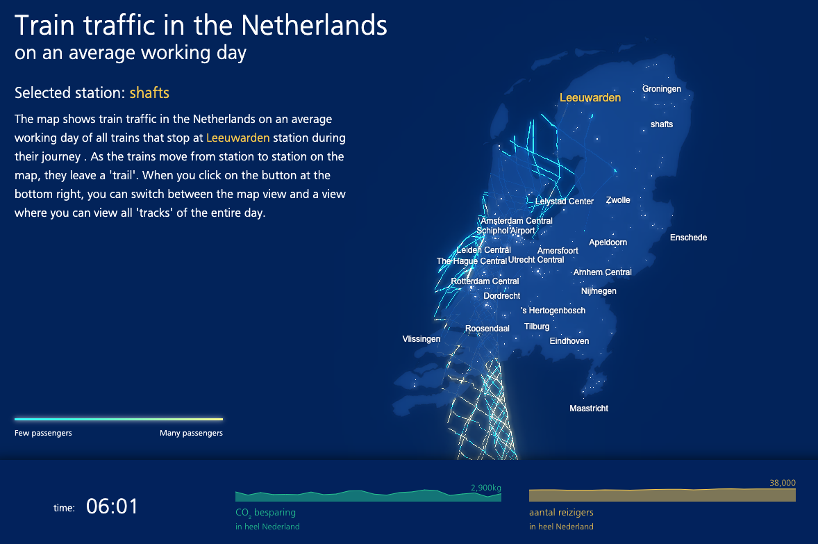
This mind-melting, dimension-defying visualization of train traffic in the Netherlands was dominating my Twitter feed last week. Jan Willem Tulp published this latest project and it is undeniably cool, but perhaps even more incredible is this: he convinced the Netherlands government to do something so creative and unconventional with their dataset. Plenty of governments would have thrown it in a bar chart and called it a day. Explore the multi-dimensional journeys of trains through cities in an average day.
Words to read

Why you sometimes need to break the rules in data viz
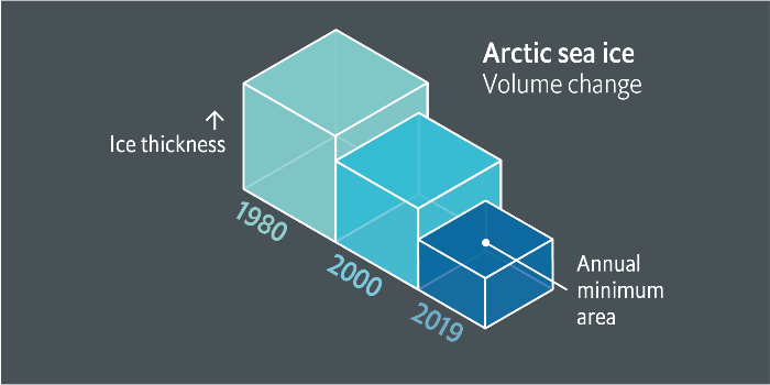
Something that I've always felt, but never seen put so eloquently and with so many amazing examples. The Economist puts this theory to the test to great effect, and their recent foray into the world of 3d bar charts (*gasp*) is proof.
The ice is melting. The story is what matters. And despite all the chart purists out there who would never dream of doing a 3d bar, I am here for this melting icecube viz. Read the full article for tips on when—and also when not—to break the holy rules data visualization.
Visuals to explore

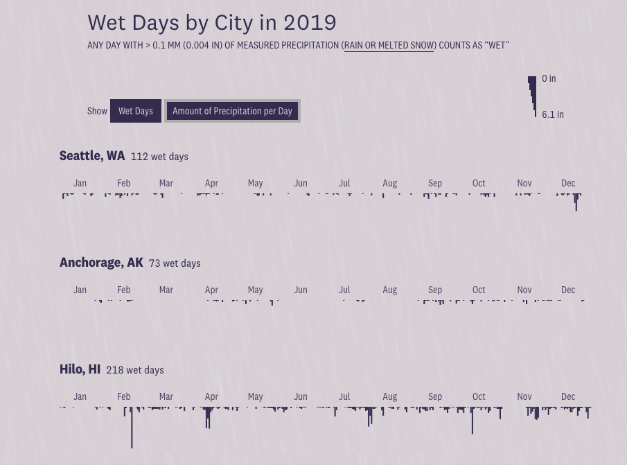
Where will you need an umbrella more?
Such a simple but interesting topic. People talk about it all the time. I particularly enjoy the simplicty and effectiveness of the precipitation chart as it animates between "wet days" as a range plot and "amount of precipitation per day" as upside-down bars.
Elsewhere:
Google Trends teamed up with The Pudding to analyze GIF keyboard data in pop culture references. Love the clever use of JSfiddle here to embed small widgets in Medium posts by the way.
WSJ visualized the stock market decline from coronovirus news as petri-dish-like packed bubbles
How close do you live to a Whole Foods? This study says you're probably a Democrat. A fascinating geospatial analysis from the NYT.
I really liked this fun little primary quiz from Bloomberg Graphics on the history of candidates who started out losing in the primaries
Things to learn
Why you should stop installing Python packages globally
Trust me, I have been there many many times: you are debugging your code and have no idea what happened, until you check the package versions. I started using virtual envs for every Python project last year and haven't looked back since.
A front-end checklist for your next web project
As someone who made their way into the development world through unconventional means (journalism, design, data), it's helpful to have a reminder of "best practices" before pushing an HTML page to production.
Spread the love.
Share this edition of Data Curious.
And say hello! I'm on:
Have a suggestion? Want to get in touch?
Fill out this quick form and I'll get back to you soon.
If you're not a subscriber yet to this newsletter, you can sign up .


