Visualizing the mathematical universe
Data
Curious
2020.02.18
Hey,
Do you remember pre-algebra class? Do you remember calculus, or trigonometry, or geometry?
Did you hate it too?
When I was in high school I detested mathematics. It was dry, boring, too abstract, in-accessible. I wanted to be a writer. I wanted to express myself in books and poems and longform stories in magazines.
And now I visualize numbers for a living.
It's funny how our minds change as we get older, taking us into careers we never thought we could go. But it wasn't just getting older, more mature, more curious: it was a new way of seeing mathematics.
We can see numbers.
Algorithms can become living, evolving patterns in 2 and 3-dimensional space. Visualization gives us a new way of learning.
Data viz was my re-introduction to math. It gave me new tools to conceptualize and understand abstract concepts. My favorite viz from the past few weeks does just that.
I hope you enjoy exploring the "map of mathematics" as much as I do, along with the other links for the week.
- Ben
Viz of the week

Quanta Magazine has released a "map of mathematics" that is, as quoted from the source, "...surprisingly simple, absurdly ambitious and necessarily incomplete guide to the boundless mathematical universe." I'm obsessed.
Words to read

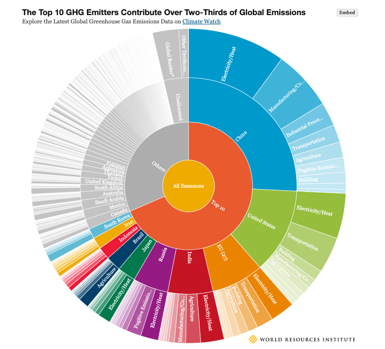
4 Charts Explain Greenhouse Gas Emissions by Countries and Sectors
World Resources Institute put together this interactive explainer on how GHGs breakdown by location and industry. I like the level of customization offered for each chart. The sunburst above (although it's pushing the color limit) is particularly nice.
A dataset of credibly accused Catholic priests
ProPublica has assembled the only nationwide database of priests deemed with credible sexual assault charges against them. In this article, they explain how they compiled the database and where you can access it.
Mapping Ourselves
Came across this case study last week on Twitter. The Pentagram team, led by designer Giorgia Lupi of "Dear Data" fame, created a beautiful project that incorporates data tracking, illustration, and visualization to "analyze our communities of care".
Visuals to explore

Make your visualizations fun with "Joyful Data"
Data studio Gramener has released a new "tool for making beautiful data-driven graphics" called Joyful Data. The browser-based app is built on Joy.js, a creative coding library built by Nicky Case. It uses human-syntax-like statements to "code" visual graphics. Gramener's take is fun and refreshing, and a good example of "thinking outside the box" when it comes to charts. Check out the demos.
Things to learn
Svelte loves D3: a repo!
Even though it's a bit incomplete, I was very pleased to stumble upon this Github repo from a talk given by Matthias Stahl. It contains a few PDF slides and some examples for how to create Svelte components with D3. I've been seeing a lot of buzz around Svelte lately, especially from a few data viz / graphics folks, so I'm interested to check it out for myself.
A graphics framework built on Svelte
Speaking of Svelte, I also discovered this new framework for creating responsive, reusable charts with SVG, HTML, Canvas and WebGL. The gallery is pretty impressive and there are some nice Svelt-y animations in between too.
Spread the love.
Share this edition of Data Curious.
And say hello! I'm on:
Have a suggestion? Want to get in touch?
Fill out this quick form and I'll get back to you soon.
If you're not a subscriber yet to this newsletter, you can sign up .


