Is football actually boring?
Data
Curious
2020.02.03
Hello,
As we enter Black History Month, I'm thinking about how data visualization has been used to explore issues of race and oppression. One of the most striking examples I've seen was created by W.E.B. Dubois and his all-black team nearly 118 years ago.
If you haven't already seen it, I'd recommend starting with this fantastic analysis from Jason Forrest: W. E. B. Du Bois’ staggering Data Visualizations are as powerful today as they were in 1900.
These data visualizations are evocative and beautiful. They are also a stark reminder of the reality of these numbers: how they may have changed and how they have stayed the same.
The numbers we visualize matter. They hold stories and lives. This month, I'll be looking out for more data visualizations containing the stories of marginalized people. If you think of anything notable, let me know.
- Ben
Viz of the week

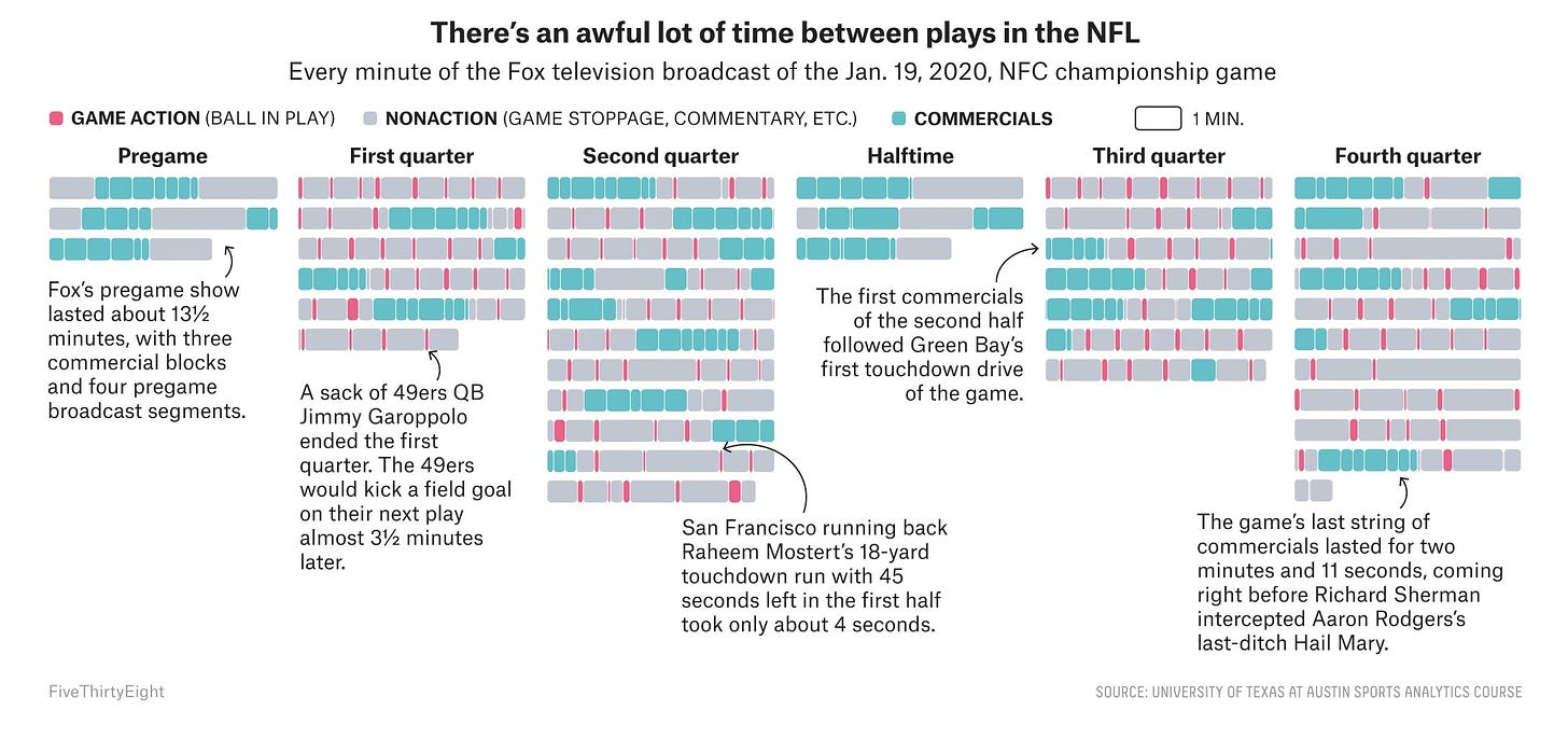
FiveThirtyEight asks a very important question: How Much Football Is Even In A Football Broadcast?. This chart, among others in the piece, show how football is a long, slow, and (dare I say it?) boring affair. Data doesn't lie: you really are just watching commercials and men standing around on a field waiting for the whistle.
Words to read

Blog: My year in data, a visual look back on 2019
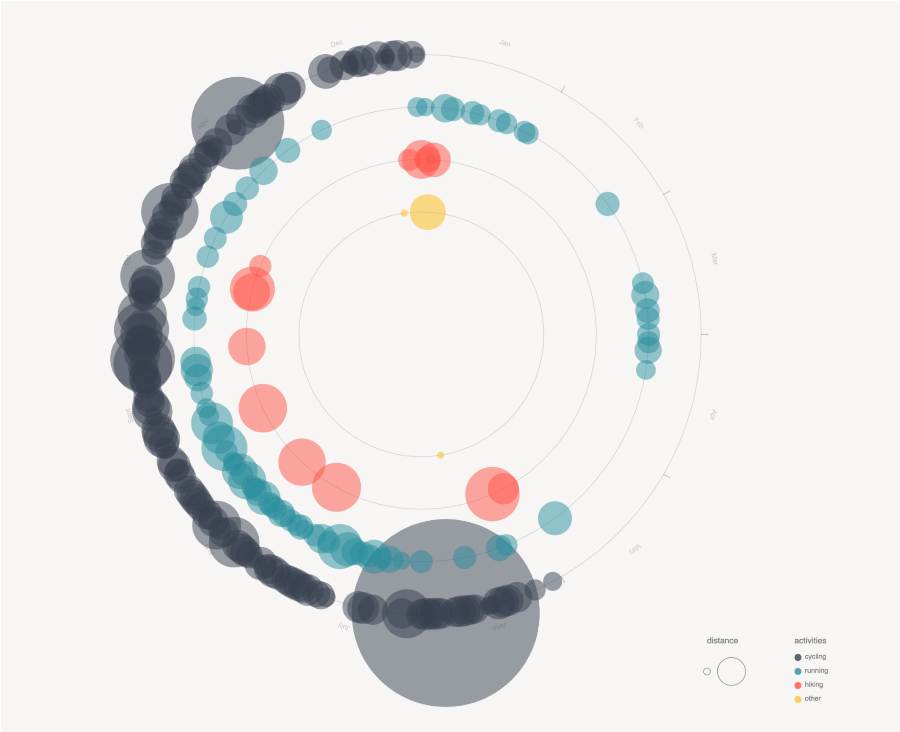
After finishing my recent data viz exploration, I wrote about my experience for Nightingale (journal of the Data Viz Society). You can read what I learned from tracking, analyzing, and visualizing *almost* all my data for a year here (it's a friends link, so no paywall!).
Uncertainty toolkit for data analysts
Created specifically for analysts in government, the ONS released this guidance document for how to visualize and communicate uncertainty in data.
How The Economist designs charts for Instagram
Simplify. Reduce clutter. Highlight the takeaway. Visual data journalist Helen Atkinson explains the process for adapting Economist charts to Instagram in detail. An incredibly important skill.
Visuals to explore

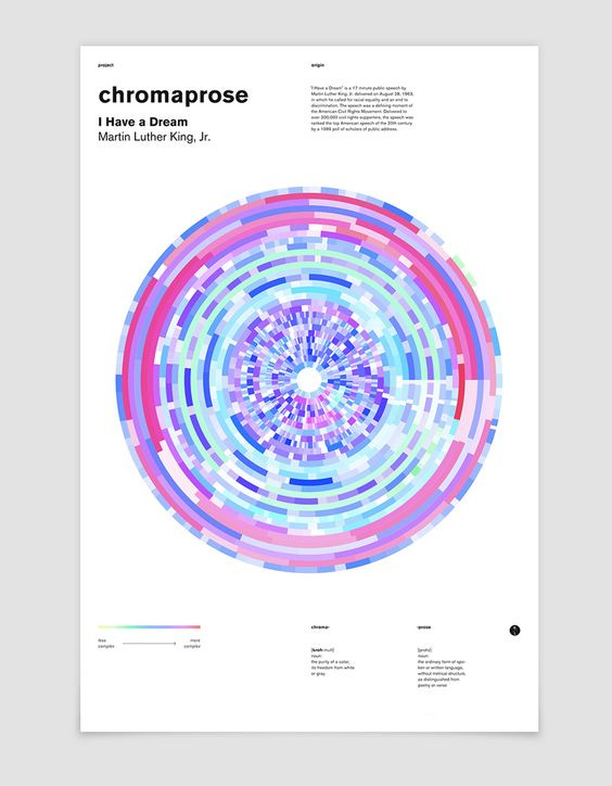
Chromapoems: Visualizing famous speeches and poems from history
I have always loved this project by Lola Migas. Text is analyzed in real-time by Processing and then colors are assigned to sentences based on their complexity. I've been thinking about this project more as we enter Black History Month and people start to revisit the speeches of famous black icons such as MLK.
Elsewhere around the web
Nancy Duarte visualized the "I Have a Dream" speech and why it was so effective (way back in 2011 no less!)
BBG Graphics made a weird exploded, interactive cartogram of the US to track the 2020 presidential delegates
I very much enjoyed the latest Data Stories podcast episode with Marcin Ignac about the intersection of data art and visual programming
Things to learn
Create artistic street maps in Python
Use OSMNX (an Open Street Map package), GeoPandas, and NetworkX to visualize the street network of any city. This tutorial looks like a lot of fun!
Make responsive, Javascript-free charts
Responsive charts? No JS? Pure SVG? What is this trickery...Rich Harris explains in his recent tutorial.
Spread the love.
Share this edition of Data Curious.
And say hello! I'm on:
Have a suggestion? Want to get in touch?
Fill out this quick form and I'll get back to you soon.
If you're not a subscriber yet to this newsletter, you can sign up .


