

Visualizing a year of data
Data
Curious
2020.01.27
Hey,
Last weekend I had the pleasure of attending an art gallery of data visualizations curated by a friend. Even though I stare at data viz nearly every day, seeing these pieces printed out and hung in a gallery reminded me of the artistic nature of what we do.
Data visualization is, if there ever was, the near perfect combination of science and art. At least to me. And sometimes it's easy to lose sight of the art side.
This week I'm thinking about expressing data through personal exploration and taking a step back from the "technical weeds".
Onto the links!
- Ben
Viz of the week
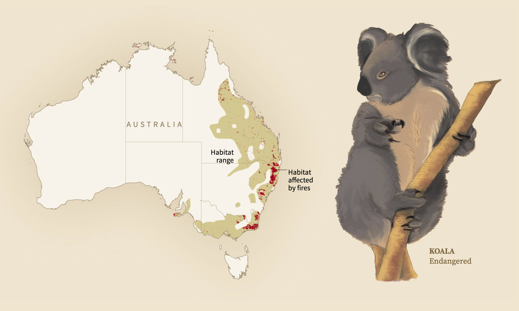
This map + illustration combo comes from a heartbreaking and beautiful piece from Reuters Graphics. There have been many visual unpackings of the wildfires to date, but this one stood out for it's tasteful combination of illustration and geographic mapping. For some reason it really hit home for me being able to see an artistic rendering of these endangered species alongside the data of how they are being burned out.
Words to read
Global Information Design: A New Framework for Understanding Data Visualization
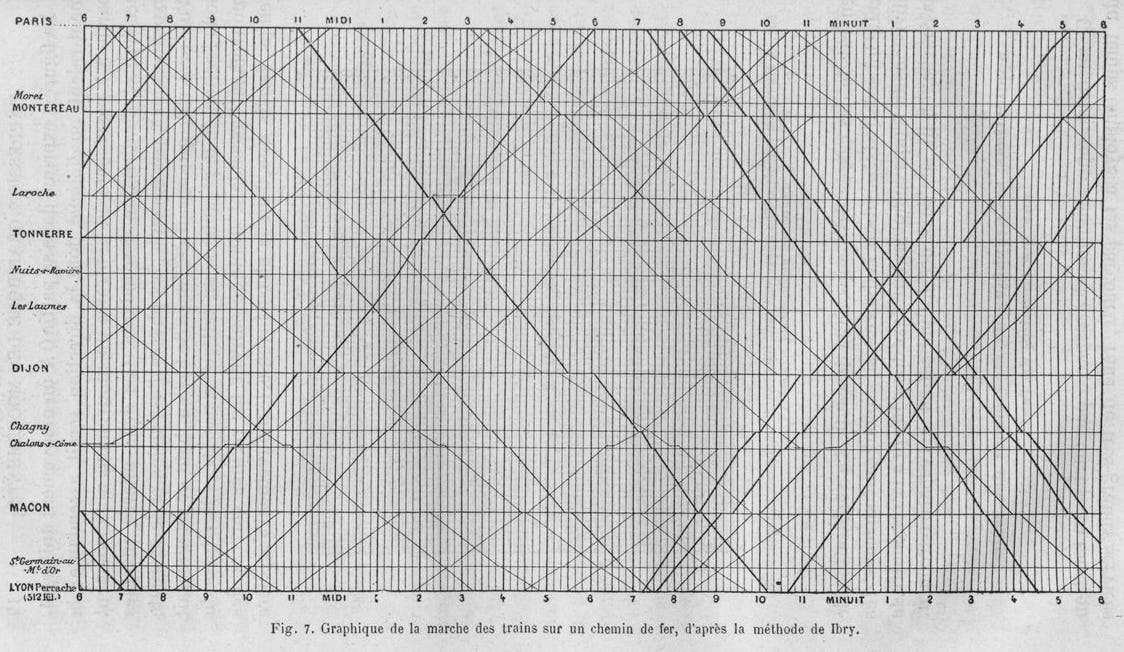
Paul Kahn takes a look at how information design has changed across history, culture, and society. This retrospective does an amazing job of picking apart the encodings for each visualization. It also reveals an often forgotten truth: humans have been making data visual for a very long time.
How We See Our Data: Vision Science and Visualization, Pt. 1
How do people see data naturally? How can we use vision science to make our message clearer? Find out in part 1 of this series from the fantastic Medium publication Multiple Views.
Visualizing the brain
Scientists at Google published the largest high-resolution 3d mapping of the brain. Granted, it's a fly brain, but still: very cool.
Visuals to explore
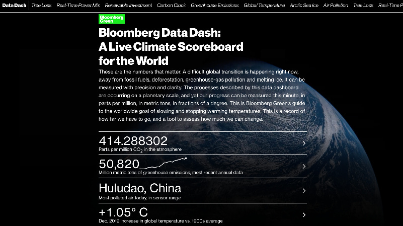
Bloomberg Data Dash: A Live Climate Scoreboard for the World
the Bloomberg graphic team released a Very Big Project. The new DataDash visualizes real-time climate data across key indicators. Each stat is shown in summary, with an entire interactive page behind each to dive into historical data for context. I love everything about this project. This is the kind of interactive work that newsrooms should be doing.
My year in data, visualized
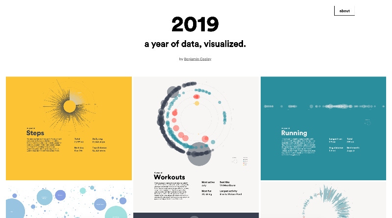
Last week I finished a recent side project: visualizing all the data I collected about myself from 2019. Naturally, this consisted of mainly fitness data, but I also included laptop usage and music habits. All "data posters" were coded in p5.js and Javascript. You can view all of them here (behind-the-scenes blog post on how I did it coming soon!).
Elsewhere around the web
Things to learn
Simulate Random Walks in Python
Learn how to create and visualize random walks with Matplotlib.
Visualize text patterns
Learn how to analyze patterns in text data using the SpaCy NLP library and ScatterText for visualizing the result (both written in Python).
Build lightweight, zero-dependency SVG charts
Browse this tutorial on how to use Frappe Charts to create lightweigth chart components. They are also responsive out of the box!
Spread the love.
Share this edition of Data Curious.
And say hello! I'm on:
Have a suggestion? Want to get in touch?
Fill out this quick form and I'll get back to you soon.
If you're not a subscriber yet to this newsletter, you can sign up .