Be curious. Learn in public.
Data
Curious
2020.01.13
Happy 2020,
Data Curious is back! And now with a new look and feel. I've decided to simplify the newsletter and bring it back to the bare essentials.
You'll also notice there are a few pictures now in addition to words. As much as a love a bare-bones, minimalist aesthetic, most of what I do all day depends on creating pictures. So it seemed only right to start incorporating something to look at and be inspired by from within the newsletter.
I hope to be offering the same dose of inspiration in your inbox *nearly* every week. We'll see how that goes. But I also want to start introducing new ways of learning and experimenting.
2019 was a huge year of learning for me. Not only did I learn more about data science, frontend development frameworks, and Javascript in general, but I also took a brief dive into the world of creative coding, did some UX consulting and started numerous unfinished side projects.
With that in mind, I'd like to share two light resolutions with you:
1. This newsletter will continue to focus on communicating with, analyzing, and visualizing data; but I will also be sharing other creative work that inspires me. Some of the best data visualizations are inspired by art that has nothing to do with data. I think we can learn a lot from other industries like creative coding, graphic design, illustration, interaction design, etc.
2. I will be sharing more experiments. If 2019 was the year of unfinished perfect projects, 2020 will be the year of mostly finished, good enough projects. That means sharing some things that I have built which I know could be better, but choose to release it into the wild because I want to learn, fail, and grow. As Voltaire wrote: "Perfection is the enemy of the good".
Let's start 2020 being bold. Make mistakes. Learn in public. Share your work.
Keep being curious.
- Ben
Viz of the week

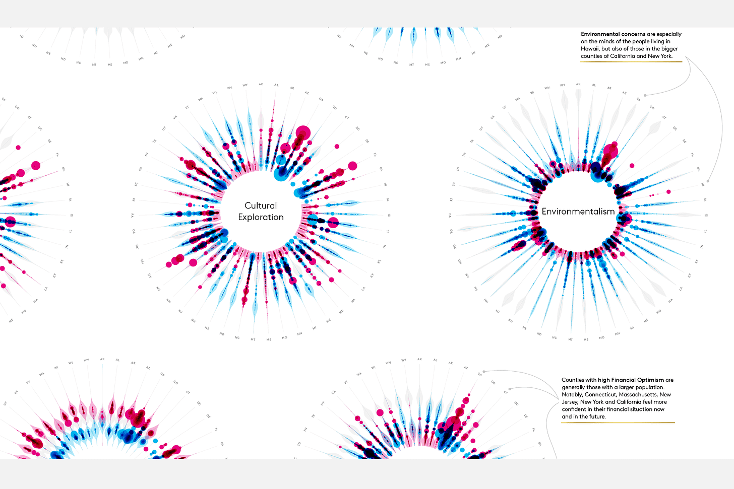
Nadieh Bremer created a data viz poster for Kantar Consulting which visualized American consumers along 12 “attitudinal dimensions”. Love the radial bubbles and shaded areas here.
Words to read

Here's what I learned from 30 days of creative coding (a Codevember retrospective)
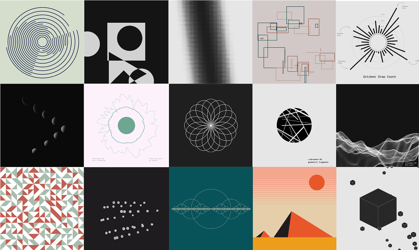
After taking on the Codevember challenge last year, I finally got some time to reflect on what I learned. While it was exhausting to code a new creative sketch every day of November, I loved getting to learn more about creative coding and generating random patterns. Read what I discovered about p5.js and creative coding here (Medium friends link).
Show your error
Elsewhere, emerging uncertainty-in-visualization expert Jessica Hullman really, really wants to see more error bars on your charts. Why? If you're visualizing a prediction, there are probably a few possible scenarios. So show them.
Awareness or accuracy?
A Twitter debate over artistic renderings of maps popped up after the BBC criticized the spread of an image of Australia burning. Some data viz practitioners defended the map as being basically accurate, and serving a larger purpose so hey, let's give the guy a break. But others joined the BBC in saying that declaring artistic renderings as data visualization may stoke dangerous misinformation campaigns. Is spreading awareness to the masses more important than maintaining integrity of the data?
Visuals to explore

FiveThirtyEight's "Best and Weirdest" Charts of 2019
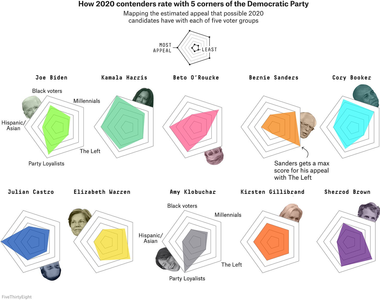
You may have already browsed some data viz "best of" lists from last year. I especially like looking back on the work of the FiveThirtyEight visual journalism team though. They always seem to combine weird visualizations with fun, quirky graphics that I've never seen before.
If you're looking for more stellar data journalism, trawl through this monster end-of-year graphics list archive compiled by Lisa Waananen Jones.
Things to learn
Do you really need to use that Javascript for loop?
Now I love a good for() loop as much as the next person, but this how-to article got me thinking. Turns out you can use map(), reduce(), and filter() far more efficiently (in most cases).
Now I just need to untrain my brain to write for() everytime I enter a new dataset...
Visualizing Trends on Mobile Phones: Animation or Small Multiples?
We've all seen the rise of the data-viz-GIF in recent years. Matt Brehmer and his team wondered if this presented an opportunity for mobile-based visualization methods. A key takeaway:
"In their data analysis setting, the experiment’s participants had better overall performance with small multiples, though interestingly, they preferred animation, finding it to be fun and engaging."
Read their summary here on Medium.
Spread the love.
Share this edition of Data Curious.
And say hello! I'm on:
Have a suggestion? Want to get in touch?
Fill out this quick form and I'll get back to you soon.
If you're not a subscriber yet to this newsletter, you can sign up .


